
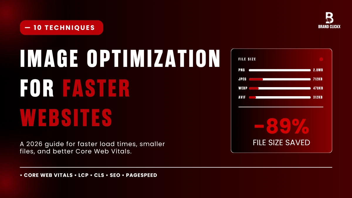
Image optimization is the first thing I look at when someone says their site feels slow.
It’s almost always that. Not the host. Not the theme. Images.
A landscaping client last week. Homepage taking 8.4 seconds to load on mobile. We dug in. Hero image alone? 3.7MB. Behind it, three product photos. Six gallery shots. Whole page weighed in at 14MB.
Got it down to 1.1MB in about forty minutes. Page loads in 2.1 seconds now.
That’s the kind of swing this stuff makes. Below are the ten things we run through, more or less in the order we hit them.
Why Images Wreck Page Speed
Roughly half the weight of a typical webpage is images. Sometimes more than half.
People upload phone photos straight to WordPress. They reach for PNG when JPEG would do. They let CSS shrink a 4000px file into a 600px container and the browser still drags down the full version.
What it costs you:
- One extra second of load time, conversions drop about 7%
- Mobile bounce rate spikes past 53% once you cross 3 seconds
- Largest Contentful Paint, which Google ranks against, is usually triggered by your hero image
So if you fix one thing on your site this month, make it your images.
1. Match the Format to the Image
Sounds basic. Half the sites we audit still get it wrong.
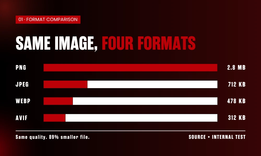
JPEG for photos. PNG for logos, screenshots with text, anything with transparency. SVG for icons or any flat graphic. WebP for almost everything else on a modern site. AVIF if you want to push smaller.
The mistake we see again and again: PNG used for product photos because someone figured it would look “cleaner.” It doesn’t look cleaner at all. The file just balloons to four times the size for zero visual benefit.
Run a quick test. Take any photo on your site. Save it as JPEG at 80% and PNG side by side. You won’t spot a difference looking at them. The PNG will be massive though.
2. Resize Before You Upload
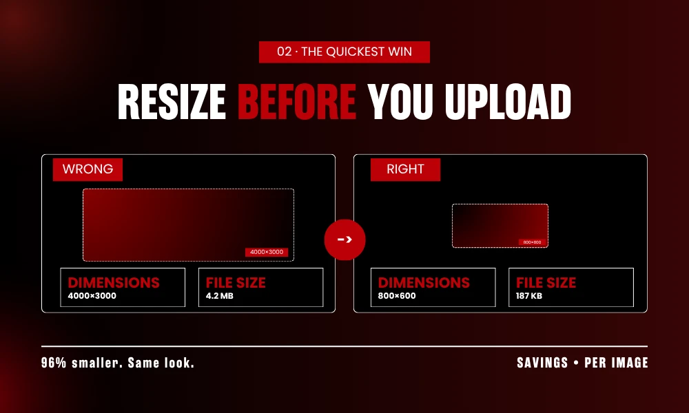
This one matters more than the other nine put together.
If your blog displays images at 800 pixels wide, the file you upload should be 800 pixels wide. Not 4000. Not 1920. 800.
Cannot stress this enough. CSS shrinking does nothing for file size. Browser still pulls down the full image and just squashes it visually.
Tools that handle it in under a minute:
- Squoosh by Google. Drop the file in. Drag the resize slider. Download. Free.
- TinyPNG. Same workflow plus compression baked in.
- Photoshop Export As. Built for exactly this.
- Bulk Resize Photos. When you’ve got fifty product shots and zero patience.
Right-click any image on your site. Check natural dimensions versus displayed dimensions. Big gap? That’s your problem. Probably across hundreds of files.
3. Move to WebP
WebP files run about 25 to 35 percent smaller than JPEG at the same visual quality. Roughly a third off your page weight, on average, for switching format.
Safari caught up years back. Every browser anyone actually uses reads WebP now. No good reason left to skip it.
Three ways to make the switch:
If you’re on WordPress, plugins like ShortPixel or Imagify run through your whole library and serve WebP automatically. One-time setup.
For one-off conversions, Squoosh.app is the cleanest tool I’ve found. Free, runs in your browser, no signup.
If your DNS sits behind Cloudflare, Polish handles it server-side without changing your source files at all.
One catch. Keep JPEG backups for anything that leaves the web. Older email tools and some print software still trip on WebP.
4. Compress, But Don’t Crush
Quality slider at 50% looks terrible. Everyone knows it. People still do it chasing smaller files.
Stop at 75 to 85 percent for JPEG. Eye can’t tell 85 from 100 on most photos. File drops by half.
What we use on the daily:
ShortPixel for client WordPress sites. Set “glossy.” Walk away.
TinyPNG for batch jobs prepping blog images.
ImageOptim on Mac for anything sensitive. Runs local. Nothing uploaded.
Squoosh when we want to hand-tune a single hero.
Real example, last month. Client’s hero was 2.4MB. Pushed it through ShortPixel at the middle setting. Came out 287KB. Put both versions next to each other and asked the client which was the new one. He picked wrong.
That’s a 91% cut. On one file.
5. Lazy Load Everything Below the Fold
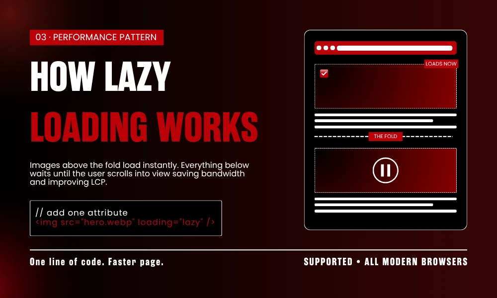
Lazy loading means images outside the viewport wait until the user scrolls toward them. They don’t all rush to load at page open.
Code is one attribute:
<img src=”example.jpg” loading=”lazy” alt=”example”>
That’s it. Stick loading=”lazy” on anything not visible on first paint and you’re done. Browser support is universal now.
WordPress turned this on by default back in version 5.5. So if you’re on WordPress, you might already be doing this without realizing. View source. Search for loading=”lazy”. If it shows up, you’re set.
Hard rule though. Never lazy load the hero. Or anything else above the fold. That’ll wreck your LCP score, which is exactly what you don’t want.
6. Serve Different Sizes With srcset
Phone screen doesn’t need a 1920px image. Wasted bytes.
Responsive images let the browser grab the right file for whatever screen it’s on. Markup looks like this:
<img src=”image-800.jpg” srcset=”image-400.jpg 400w, image-800.jpg 800w, image-1200.jpg 1200w” sizes=”(max-width: 600px) 400px, (max-width: 1000px) 800px, 1200px” alt=”example”>
WordPress does this for you. Upload one image, the theme spins up the sizes, the markup gets added without you doing anything. Most page builders too. Elementor, Divi, Bricks. All covered out of the box.
For hand-coded or custom builds, Cloudinary and imgix do the resizing on the fly. You upload one master. They serve every variant.
7. Write Alt Text That Describes Something Real
Alt text isn’t a keyword dump slot. Treat it like one and Google flags it.
Bad alt text looks like:
image optimization image optimization techniques fast website image
That’s the kind of thing that drags a page down in quality scoring.
Decent alt text looks like:
Bar chart comparing WebP and JPEG file sizes with WebP showing 32% reduction
Couple rules we stick to:
Keep it under 125 characters. Screen readers cut off past that.
Skip “image of” or “picture of.” Screen readers already say “image.”
Be specific. “Dog” is lazy writing. “Golden retriever puppy on a beach” tells the actual story.
For decorative stuff that adds nothing to the meaning of the page, use alt=””. Empty. Screen readers skip it. Which is the right call.
8. Rename Your Files Like You Mean It
Open your WordPress media library right now. Take a look.
How many files in there are called IMG_4892.jpg, Screen-Shot-2026-05-26-at-3.42.18-PM.png, or worse, final-FINAL-v3.png? Every one of those is wasted SEO surface.
Google reads filenames. Accessibility tools read filenames. Pinterest reads filenames if anyone ever shares your image.
Rename before upload:
- image-optimization-techniques.jpg ✓
- webp-vs-jpeg-comparison.png ✓
- DSC_4421.jpg ✗
- final-FINAL.png ✗
Two technical things to know. Use hyphens, not underscores. Google reads image_optimization as imageoptimization, which is useless. Keep everything lowercase too. Some servers treat Image.jpg and image.jpg as separate files and that creates broken link headaches later.
9. Lock Width and Height to Stop Layout Shift
Ever been mid-sentence reading something on your phone, image pops in, shoves the whole paragraph down? That’s Cumulative Layout Shift. Google measures it. Ranks against it.
Fix takes three seconds per image:
<img src=”example.jpg” width=”800″ height=”600″ alt=”example”>
Browser now knows how much space to reserve for the image before it shows up. No jumping.
These numbers don’t lock dimensions either. Browsers pull the aspect ratio out of them and scale responsively. So you’re not breaking mobile. You’re telling the browser the shape.
10. Drop a CDN in Front of It
Server in Dallas, visitor opening your site from Karachi. Every image makes that round trip. Adds hundreds of milliseconds per file.
A CDN stores copies of your images on servers across the planet. Visitor pulls from whatever node is closest.
Options that don’t cost much:
Cloudflare free plan. Covers most small sites. One DNS change.
BunnyCDN. Dollar a month for low-traffic sites. Fast.
Jetpack Site Accelerator. Free on WordPress. One toggle.
Cloudinary free tier. Auto-format and auto-resize bundled in.
Setup runs about twenty minutes. After that your site loads faster everywhere on Earth. Mobile users notice it most because mobile networks magnify every saved millisecond.
How to Check If Any of This Worked
Run the site through:
PageSpeed Insights for Core Web Vitals scores and a flagged list of oversized images.
GTmetrix if you want a waterfall view of which images stall the page.
WebPageTest for going deeper than either of those.
Pay attention to “Properly size images” and “Serve images in next-gen formats.” That’s where this work actually shows up in the numbers.
Don’t chase a 100 score. Green on Core Web Vitals is the bar. Stop there.
Frequently Asked Questions
What does image optimization mean, in plain English?
Making images load faster without them looking bad. You pick the right file format, shrink the file down to the size you actually display on the page, and compress what’s left.
Does any of this actually help SEO?
Quite a bit. Page speed is a confirmed Google ranking factor and images are what slows most sites down. Optimized images also rank in Google Image Search, which sends free traffic most sites just leave on the table.
Best free tool to start with?
TinyPNG for batch compression. Squoosh when you want to tune one image carefully. Both free. Neither asks you to sign up.
WebP or stick with JPEG?
WebP at this point. Smaller files, every browser reads it now, looks identical to the eye. Only reason to keep JPEG copies is for things you send outside the web.
How much faster will my site actually get?
Most audits we run, images alone cut page weight by 60 to 80 percent. Translates to a 1 to 3 second improvement on mobile. Sites that were really bloated see bigger jumps.
Wrapping Up
None of this is one big project. It’s ten small habits.
Resize before upload. Right format. Compress to 80, not 50. Lazy loading and clean alt text. CDN in front of the site. Then repeat for every new image you add.
Start with #2 if you only do one. Biggest mover on day one. Build the rest in over the next week.
Visitors will feel it before they notice it. Google too.