Your website is a chance to show off the soul of your restaurant. From the visuals to the words, every element should showcase what makes your restaurant special and appealing.
A good website can turn a browser into a regular and into everything they need to make a decision, from mouthwatering images to menu details, atmosphere, and more.
Many restaurants are already reaping the rewards of a well-designed website, and in this article, we’ll share some inspiring restaurant website examples to spark ideas for your own online presence.
Must-Have Features of a Great Restuarant Website
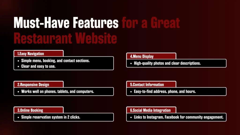
So when you’re building your restaurant website, you want it to be super easy to use, right? You don’t want your customers getting confused trying to find what they need. Here’s what really matters:
1. Easy Navigation
You know how annoying it is when you’re trying to find something on a website and you can’t figure out where to go? The same goes for your customers.
Make sure everything, such as your menu, booking system, and contact info, has its place, and it’s easy to get to.
The simpler, the better. People should be able to find what they’re looking for without having to think too much.
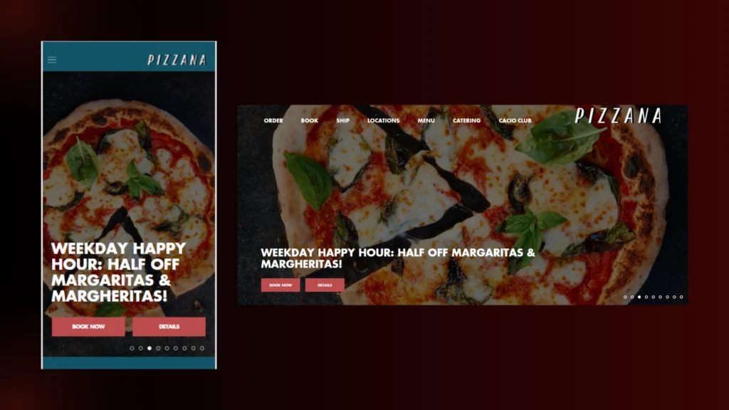
2. Responsive Design
People check websites on phones, tablets and computers. Your website needs to look good and work well on all of them.
If your site looks messy on a phone, you’ll lose visitors. A mobile-friendly design makes everything easier for customers, no matter what device they use.
3. Online Booking
Everyone’s busy, right? So if they can book a table without picking up the phone they’re more likely to actually make a reservation.
Keep your booking system simple, something they can do in 2 clicks. It’ll save them time, and they’ll appreciate it.
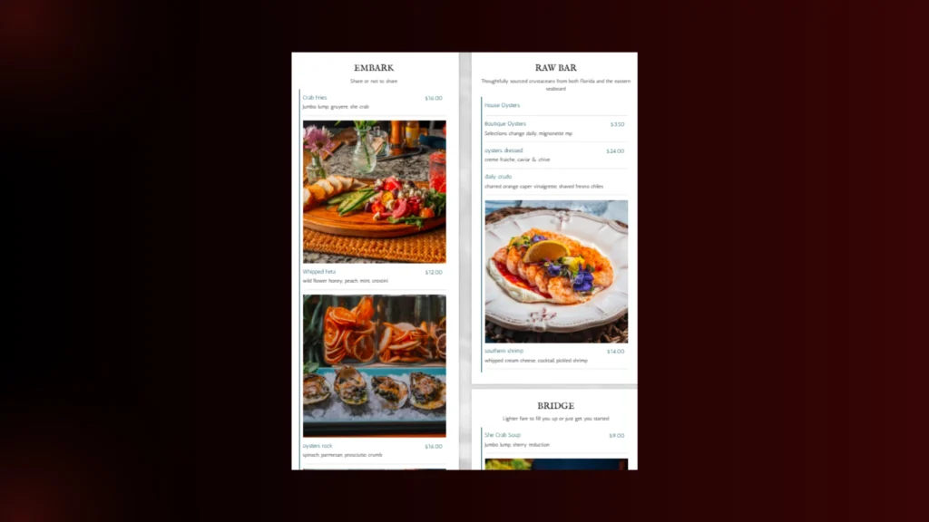
4. Menu Display
This one’s a biggie; your menu is probably the most important part of your website! You want to show off your food in the best light.
Use high-quality photos and clear descriptions and make sure it’s easy to read. People need to see exactly what they’re getting so they can get excited.
Check out the menu on The Helm’s website. It’s beautifully done, with stunning, detailed photos that truly bring each dish to life.
5. Contact Information
This one’s basic, but you’d be surprised by how often it’s overlooked. Keep your address, phone number and hours right where people can find them, no digging needed.
If someone needs to call for a reservation or get directions, they shouldn’t have to hunt for that info.
6. Social Media Integration
If people like your food, they want to see more of it, right? Add links to your social media profiles like Instagram, Facebook, whatever you’re active on.
This way, customers can check out your latest posts and specials and even sneak peeks at new menu items. It’s a great way to keep them connected and excited about your restaurant. So there you go. These are the things that will make your website not only functional but also friendly.
You want your customers to have a good time from the moment they land on your site so they’re already looking forward to walking in.
5 Best Restaurant Website Examples for Inspiration
1. Mizlala
Mizlala’s website doesn’t just look good; it feels good to use. From the moment you land on the homepage, you’re greeted with bold, high-quality images that spotlight the food front and centre.
Hummus drizzled with oil, crisp Brussels sprouts, and Moroccan fried chicken, it’s all showcased in a way that makes you want to visit now.
Restaurant website example: Appetizing food display with fries, hummus, grilled meat, and a fresh salad
But it’s not all just beauty shots. The layout is super functional. A simple, minimalist navigation bar sits at the top, guiding you to locations, catering options, press, and contact info without overwhelming the page.
It’s designed with purpose: no fluff, no scroll fatigue.
Each location has its own page, packed with handy details like parking info and ambience shots, which is a thoughtful touch for guests planning a visit. Plus, the mobile version is just as sharp, fast, clean, and optimized for anyone on the go.
What we love most:
- Strong food photography that sets the vibe instantly
- Clear, simple UX with no distractions
- Location-specific info and beautiful design consistency
- Smart use of visual hierarchy—your eye always knows where to go
If you’re after a website that balances style with straightforward usability, Mizlala nails it.
2. Sweet Cheeks Q
Sweet Cheeks Q’s website wraps you in that classic Southern charm from the second it loads. Everything from the woodgrain textures to the sizzling photos invites you to sit down and stay awhile.
Navigating the site is easy, just like it should be. The top bar keeps it simple with key links: Menu, Reservations, Events. No endless scrolls or cluttered dropdowns.
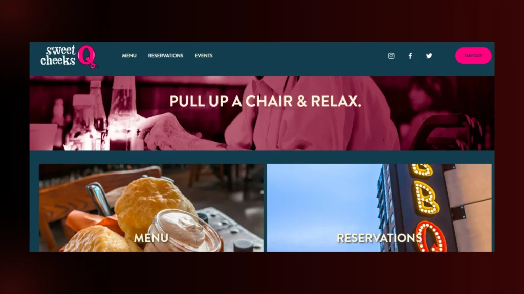
Each section is packed with personality, and the menu in particular, is a standout. Categories are neatly separated, and little touches like dietary tags and vivid dish descriptions make the experience both informative and mouthwatering.
Online ordering and reservations are smooth. And the catering page is built to convert with packages, pricing, and inquiry forms that speak directly to corporate groups and event planners.
What we love most:
- Warm, rustic design that mirrors the restaurant’s soul
- Simple navigation that puts key info up front
- Mouthwatering food photography and menu descriptions
- Thoughtful catering section for large-scale orders and events
- Social elements that keep the community vibe alive
Sweet Cheeks Q’s site isn’t trying to be flashy, and that’s exactly the point. It’s welcoming, honest, and focused on good food and good people, just like their BBQ.
3. Girl & the Goat
Girl & the Goat welcomes you with a website that feels just like stepping into the restaurant itself. From first glance, you’re treated to rich, high-quality photos that showcase both the food and the cozy interior.
The use of natural light in these images gives everything a warm, lived-in feel that mirrors the real dining experience.
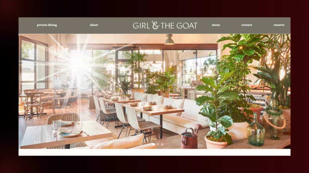
The navigation keeps it clean and simple. From browsing menus to checking out locations in Chicago and Los Angeles, everything’s right where you expect it to be. No fluff, just smooth functionality that respects your time.
Typography is another win here. Sleek, minimalist fonts pair effortlessly with generous white space, letting the visuals do the talking without losing that editorial polish.
Buttons are in plain sight, and you can’t help but click. From top to bottom, the site is the dining experience itself: stylish, accessible,and full of character.
What we love most:
- Stunning imagery that mirrors the restaurant’s ambience
- Effortless user flow from homepage to reservation
- Sophisticated type and layout that feel custom and curated
- Smooth experience across mobile and desktop
If your brand leans into charm, character, and quality, Girl & the Goat is a website worth looking up to.
4. Sona Restaurant
Sona’s website is elegant and easy to navigate, a digital reflection of the restaurant itself. The homepage opens with beautiful, mouthwatering shots of Indian dishes, each one plated and lit to perfection.
You feel like the food is just a click away. The menu, gallery, contact info, and everything else are front and centre, so you don’t have to click around.
Design-wise, the site uses a mix of deep tones and clean fonts to keep the focus on the food and the experience. Polished but not too fancy, which is perfect for a place that’s both fancy and approachable.
The About section is short and sweet and gives you a sense of Sona’s mission and commitment to flavor and hospitality. It’s not overdone, but it feels real, and that authenticity shines throughout the site.
Practical details like operating hours, delivery links, and customer testimonials are also enlisted, rounding out a site that’s not only pretty but purposeful.
What we love most:
- Beautiful food photography that whets your appetite instantly
- Simple, functional navigation that feels effortless
- Honest brand storytelling that doesn’t try too hard
- Mobile-friendly experience that works anywhere, anytime
5. O-Ya
O-Ya’s website is a quiet stunner—just like its food. The moment you land, you’re met with crisp, artful shots of its Japanese-inspired dishes.
There’s no loud intro or over-the-top animations, just pure focus on culinary craft, which is exactly the vibe O-Ya is known for.
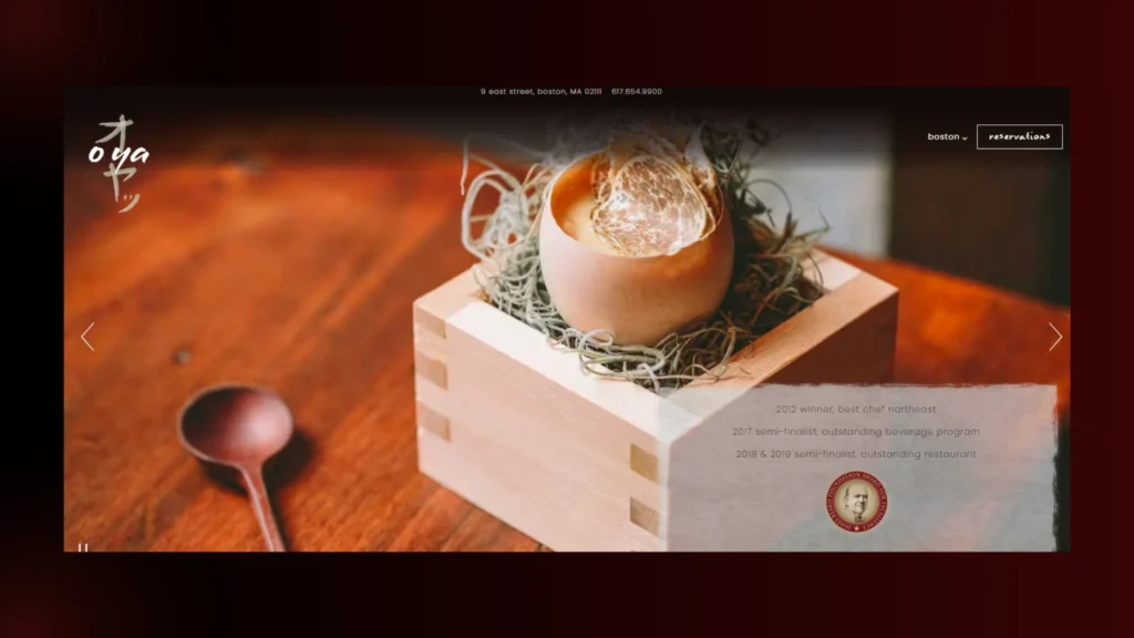
The navigation is stripped back in the best way. With just a few clear tabs for menu, reservations, and contact, the site lets you get where you need to go without a second thought. It’s smooth, subtle, and completely on-brand.
The design is O-Ya’s philosophy: less is more. A soft neutral color palette and clean typography is calm, elegant, and high-end without being loud about it. There’s trust in the restraint here.
There’s a confidence in the restraint here. No extra storytelling, no filler text. The food and the ambience speak for themselves, and the site trusts you to get it.
What we love most:
- Stunningly composed food photography that commands attention
- Clean, focused navigation that respects your time
- A minimal design language that oozes quiet sophistication
- The whole site feels like an extension of the dining room—elevated, intimate, unforgettable
Also Read Blog Posts:
- Local SEO for Restaurants: Essential Tips to Rank Higher
- Restaurant SEO New York: Increase Visibility & Reservations
- Best Restaurant Marketing Campaigns Beyond the Menu
FAQs
1. What should be on a restaurant website?
Your website should feel like a warm hug. Add your menu, contact info, hours, location, pretty food pics and a way to book or order. Keep it simple and sweet!
2. How many restaurants have a website?
Most do—around 75 to 80%. Not having a website is like not having a sign on the street. It helps people find you and trust you.
3. What makes a good food website?
Great pics, easy navigation and your restaurant’s personality shining through. It should make people hungry and want to visit or order right away.
4. What is the best restaurant review website?
Depends where you are but people mostly trust Yelp, TripAdvisor and Google Reviews. They’re the go-to’s for real opinions.
5. What website platform is best for restaurants?
Wix and Squarespace are perfect if you want something easy and pretty. WordPress is great if you want more control. Shopify is best if you also sell online.
6. How to make a restaurant website?
Choose a platform, grab a domain, and add your logo, menu, pics and key info. Make it mobile friendly and make sure everything works. Then hit publish and share it with the world!
Final Thoughts
Your website is where you get to share what makes your restaurant special. Where the flavours, the vibe and the story behind your dishes come to life.
With the right design, you can turn casual visitors into regulars so they can browse your menu, book a table or even order online – all without stress or confusion.
Looking for a website that shows off your restaurant’s atmosphere and flavours? Brand ClickX can help you with that. Get in touch with us and let’s build a website that captures your restaurant’s essence and makes it unforgettable for your customers.


