Ever bought something online and got stuck in a checkout that felt like it went on forever? Such an annoying moment! No doubt, a clunky, complicated checkout is one of the top reasons people abandon their carts. On the flip side, a see-through checkout experience can turn browsers into buyers.
People don’t want to waste time filling out unnecessary info or second-guessing their purchase. They want a checkout page that’s fast, clear and easy—one that feels like the next step, not the obstacle.
This guide will show you what makes a good checkout page, different design approaches and real examples that get it right. Whether you’re designing for an online store, a subscription service or digital products, you’ll find lots of checkout page design ideas and inspiration to create a page that keeps customers moving forward, not clicking away.
Essentials of a Checkout Page
A checkout page should feel like the next natural step, not an obstacle. No one wants to go through a long process to buy something they already decided to buy.
A good checkout is easy, fast, and stress-free. So, customers don’t change their minds.
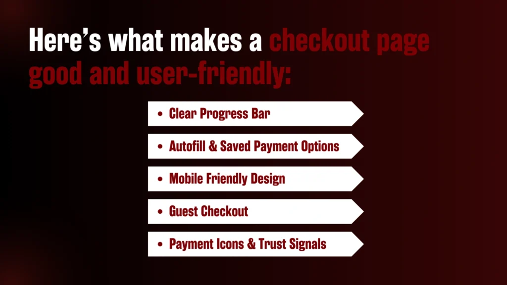
Here’s what makes a checkout page good and user-friendly:
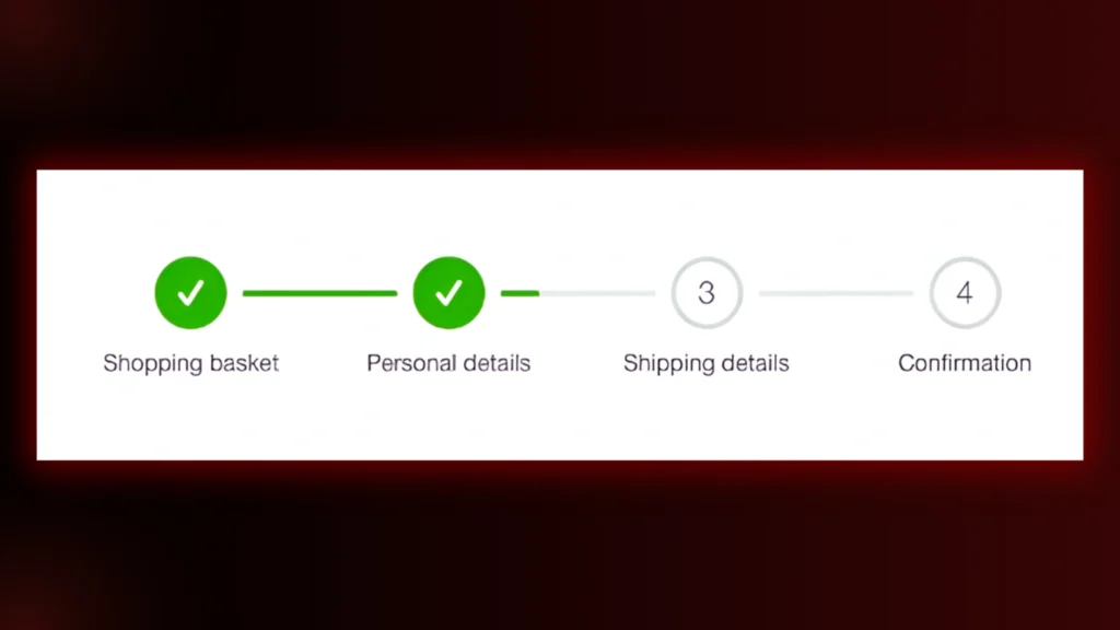
1. Clear Progress Bar
Ever check out and think, “How many steps left?” That uncertainty is annoying. A simple progress bar (like Cart → Personal Details → Shipping details → Confirmation) helps customers see where they are and what’s next. So, they keep moving forward instead of getting stuck.
2. Autofill & Saved Payment Options
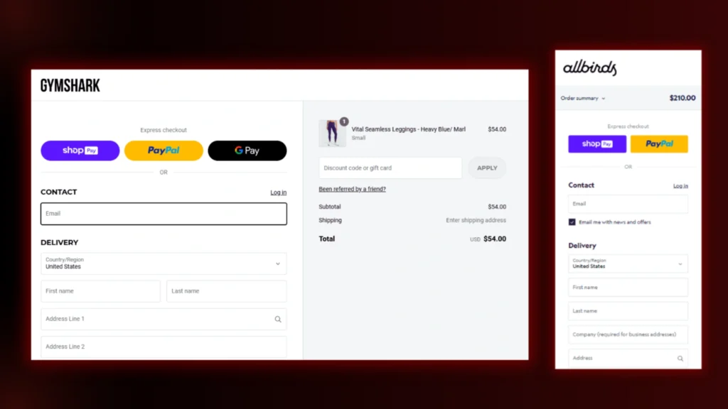
Nobody likes typing out their address and card details every single time. Autofill and saved payment options (like Google Pay, Apple Pay, or saved cards) make checkout almost painless. The faster the process, the less likely someone will get distracted or abandon their cart.
3. Mobile Friendly Design
A checkout page that’s hard to navigate on a small screen is a dealbreaker. Since most people shop on their phones, big buttons, easy-to-read text, and a clean layout make checkout quick and painless—no matter what device they’re using.
4. Guest Checkout
Forcing people to create an account before they can buy? That’s a surefire way to lose customers. While accounts can be helpful, many shoppers just want to check out fast. Offering a guest checkout removes unnecessary steps and keeps it simple.
5. Payment Icons & Trust Signals
Before entering payment details, customers need to feel safe. Seeing security badges, SSL encryption notices and familiar payment options (like Visa, Mastercard or PayPal) instantly builds trust. If a checkout page looks sketchy or unreliable, chances are the sale is gone.
Types of Checkout Page Designs
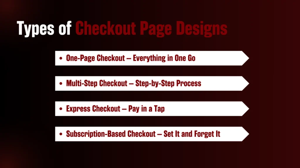
1. One-Page Checkout – Everything in One Go
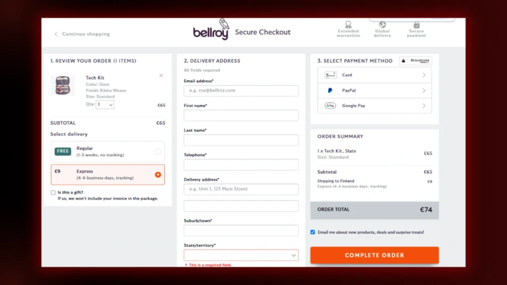
This type of checkout keeps the process simple. You fill in your details—shipping, billing, and payment—on a single page. No extra clicks, no endless forms. It’s fast and convenient, especially if you’re in a hurry.
Bellroy’s checkout page keeps everything in one place but organizes it neatly so it doesn’t feel overwhelming.
2. Multi-Step Checkout – Step-by-Step Process
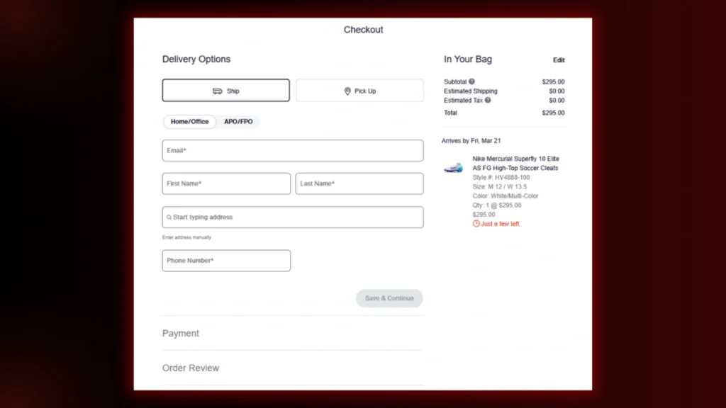
Some stores break the checkout process into multiple steps. First, your cart, then shipping details, followed by payment. This makes things feel more structured and manageable, especially for bigger orders.
Nike does this well by guiding you through each step while giving you options to edit along the way.
3. Express Checkout – Pay in a Tap
Ever used Google Pay, Apple Pay, or PayPal to check out instantly? That’s express checkout. It skips the usual form-filling and lets you pay with saved details. Super handy when you don’t want to dig out your card.
4. Subscription-Based Checkout – Set It and Forget It
If you’re signing up for something like a meal kit, magazine, or razor subscription, you’ll go through a checkout designed for recurring payments. These pages often let you choose your plan and billing cycle before confirming.
Best Practices for a Smooth Checkout Experience

A messy checkout page is the fastest way to lose a customer. No one wants to fight through cluttered forms, hidden fees, or confusing buttons just to buy something. The easier you make it, the better. Here’s how to design a checkout page that feels effortless:
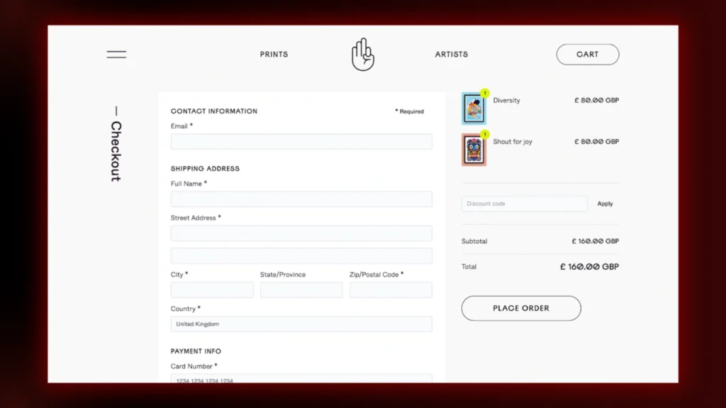
1. Keep It Clean & Clutter-Free
Think of your checkout page as a well-organized desk. No distractions, no unnecessary elements—just the essentials.
A simple, minimal design helps shoppers focus on completing their purchase without getting lost. Get rid of pop-ups, extra banners, and anything that might pull them away.
2. Offer Multiple Payment Options
Not everyone wants to enter their card details manually. Some prefer PayPal, others go for Apple Pay, and plenty use Buy Now, Pay Later options.

The more choices you offer, the less chance a customer will leave just because their preferred method isn’t available.
3. Don’t Make Forms Feel Like Homework
Nobody likes filling out long, unnecessary forms. Ask for only what’s needed—name, shipping address, and payment info.
Auto-fill and address suggestions make things even smoother. The shorter the process, the faster they can hit “buy.”
4. Show the Order Summary Upfront
Customers hate surprises—especially when it comes to price. Show the total cost, shipping fees, and any discounts before they reach the payment screen. A clear, detailed order summary builds trust and keeps them from second-guessing their purchase.
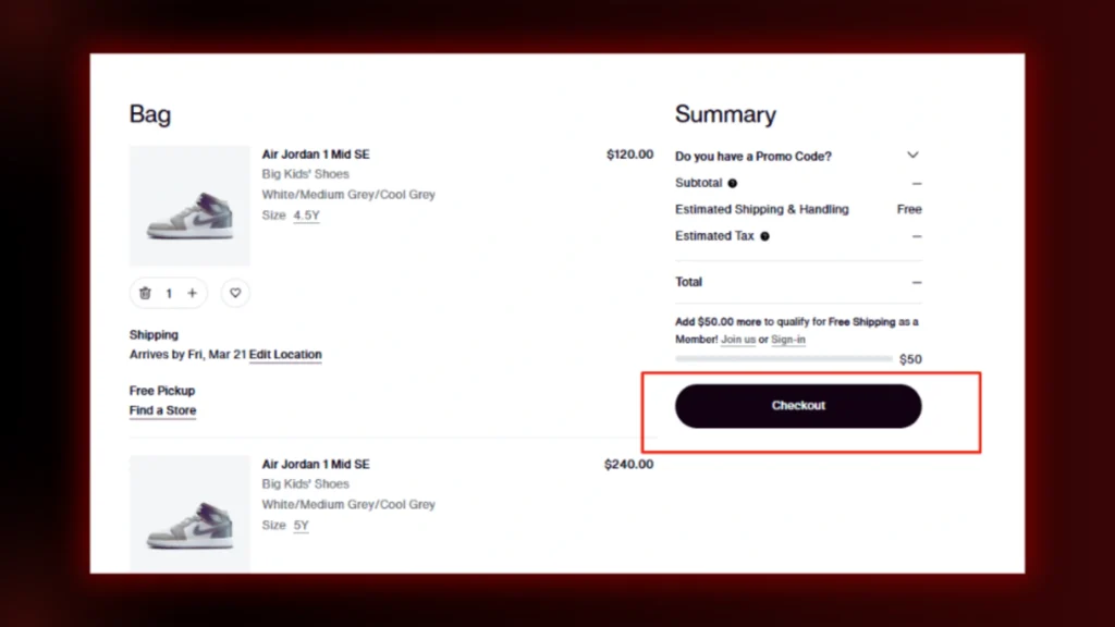
5. Make the “Buy” Button Stand Out
Your checkout button is the final step, so don’t let it blend into the background. Use bold colors and clear wording, such as “Complete Purchase” “CheckOut” or “Place Order,” instead of vague words like “Next.” It should be obvious where to click.
6. Be There When They Need Help
If something goes wrong, customers should be able to get support right there. A live chat, a quick FAQ section, or a visible help button can stop them from abandoning the purchase. Even a simple “Need help?” link next to the payment options can make a difference.
Inspiring Checkout Page Designs from Popular Brands
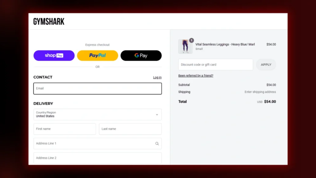
1. Gymshark – Clean UI & Clear Order Summary
Gymshark keeps checkout simple and distraction-free so you can buy quickly. The order summary is well-structured so you can review your items. Clear shipping and payment options make the process smooth.
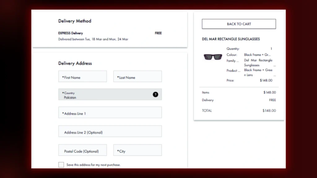
2. MVMT – Minimalist, Visually Appealing Checkout
MVMT’s checkout is minimalist and clutter-free. It also provides a detailed summary of your purchase. Plus, it offers multiple payment options (Shop Pay, PayPal, Apple Pay) for a quick and seamless purchase.
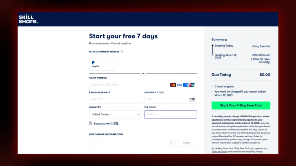
3. Skillshare – Free Trial Focused, User-Friendly Flow
Skillshare’s checkout is optimized for conversion. Strong focus on the free trial. Page reassures you that you can cancel anytime. Step-by-step process to sign up.
4. Airbnb’s Transparent Checkout Experience
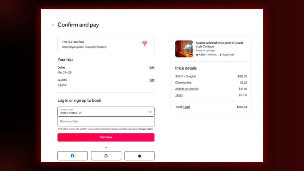
Airbnb’s checkout page is simple and clear. It shows the total cost upfront, including fees and taxes. No surprises. The urgency badge (“This is a rare find”) prompts you to book fast. Reviews and Superhost badges give trust.
Frictionless login options are available to sign in with Google, Apple, or Facebook. The fastest way to sign in. Big “Continue” button and an optimized layout so you can book without distractions.
5. Bed Bath & Beyond Checkout Page
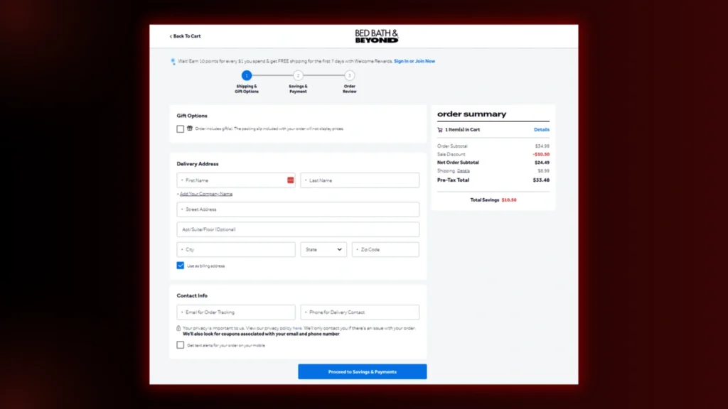
The Bed Bath & Beyond checkout page is clean, user-friendly, and structured for a smooth purchasing process. It includes sections for gift options, delivery details, and contact information, ensuring convenience.
The order summary highlights discounts, shipping costs, and total savings, making pricing transparent. A progress tracker keeps users informed, and an automatic coupon lookup adds value. With a secure and simple layout, the page ensures a hassle-free checkout experience.
Read Blog Posts:
- 13 Web Design Tips for Small Businesses to Boost Sales Fast
- How AI Has Been Affecting UX Design: Key Changes & Impact
FAQs
1. What should a checkout page look like?
A checkout page should be clean, simple, and user-friendly, with clear steps for completing a purchase.
2. How to design a checkout page?
Use a minimal layout, clear form fields, progress indicators, and secure payment options.
3. How do you collect design inspiration?
Analyze competitor websites, explore UI/UX trends, and study customer behavior.
4. What is the content of a checkout page?
It includes shipping details, payment options, order summary, discounts, and a confirmation button.
Final Words
A well-designed checkout is key to turning prospects into customers. A smooth, transparent and frictionless process keeps users engaged, reduces cart abandonment and builds trust.
Whether it’s a one-page checkout for speed, a multi-step process for clarity or an express checkout for convenience, the right design makes all the difference.
By keeping it clean, offering multiple payment options and being mobile-friendly, you create a checkout that feels like a step forward—not a hurdle.
Want a high-converting checkout page that keeps customers coming back? Let Brand ClickX help you.


