
AI Summary
This is a rundown of the most significant brand rebrands of 2026 so far the ones with real strategic reasoning behind them, not just cosmetic logo tweaks. It walks through Warburtons’ 150th-anniversary redesign across 70-plus products, House of Fraser’s rename to FRASERS, Allica Bank’s radical minimalism built around a single orange bowler hat, Verizon’s checkmark refinement, and other notable identity moves from the first half of the year.
It also explains the underlying trend that ties most of them together a shift away from “reinvention” rebrands (new name, new look, new story) toward what industry writers are calling “getting out of your own way” using existing brand assets more confidently instead of replacing them. Written for marketers, designers, business owners, and anyone curious about what actually works in brand identity right now.
The Short Version
Rebranding gets talked about like it’s an act of reinvention.
New name. New look. New story. Clean break.
That’s usually how rebrands go wrong.
The best brand rebrands of 2026 have done the opposite. They didn’t start with a blank page. They dug for what already existed the color, the name, the feeling and decided to use it properly, sometimes for the first time in decades.
This is the article about which brands got it right, and why.
Key Takeaways
- Warburtons redesigned its entire 70+ product portfolio for its 150th anniversary, keeping its iconic “Baked Orange” color and adding the chairman’s actual signature to packaging.
- House of Fraser became FRASERS in March 2026 dropping the “House of” turned a heritage department store into a modern retail group without inventing anything new.
- Allica Bank built its rebrand around a single orange bowler hat that’s the logo. The whole thing. Because SME banking needed a personality, not another sans-serif.
- Verizon refined its checkmark for digital clarity a small change with big implications for mobile-first brand recognition.
- The theme of 2026 is subtraction, not addition. The best rebrands removed things (a word, a color, a badge) rather than adding new ones.
- “Iconomics” bled into brand identity the same trend that shaped 2026’s best advertising campaigns is now shaping how brands rebrand themselves.
- Big rebrands can fail badly. Jaguar’s 2024 transformation into an all-electric brand is still being debated as a warning story two years later.
What Actually Changed in 2026
If you look at the rebrands that got attention in 2026, one word keeps coming up.
Confidence.
Not confidence in the “big flashy launch” sense. Confidence in the “we already have what we need” sense.
Warburtons already had a color. House of Fraser already had a name. Allica Bank already had a hat. Verizon already had a checkmark. In every one of these cases, the rebrand didn’t invent new brand assets. It found the ones that had been sitting there underused and put them at the center.
That’s the shift.
The last decade of rebranding think Tropicana in 2009, Gap in 2010, the endless parade of tech companies flattening their logos into generic sans-serifs was defined by companies chasing “modern” and discovering, too late, that their audience wanted the thing they had thrown away.
The 2026 rebrands learned that lesson.
The Big Ones So Far
Warburtons: 150 Years of Baked Orange
Britain’s biggest bakery brand turned 150 in 2026.
That milestone could have gone a lot of ways. A heritage campaign. A limited-edition tin. A celebrity ad with rolling countryside.
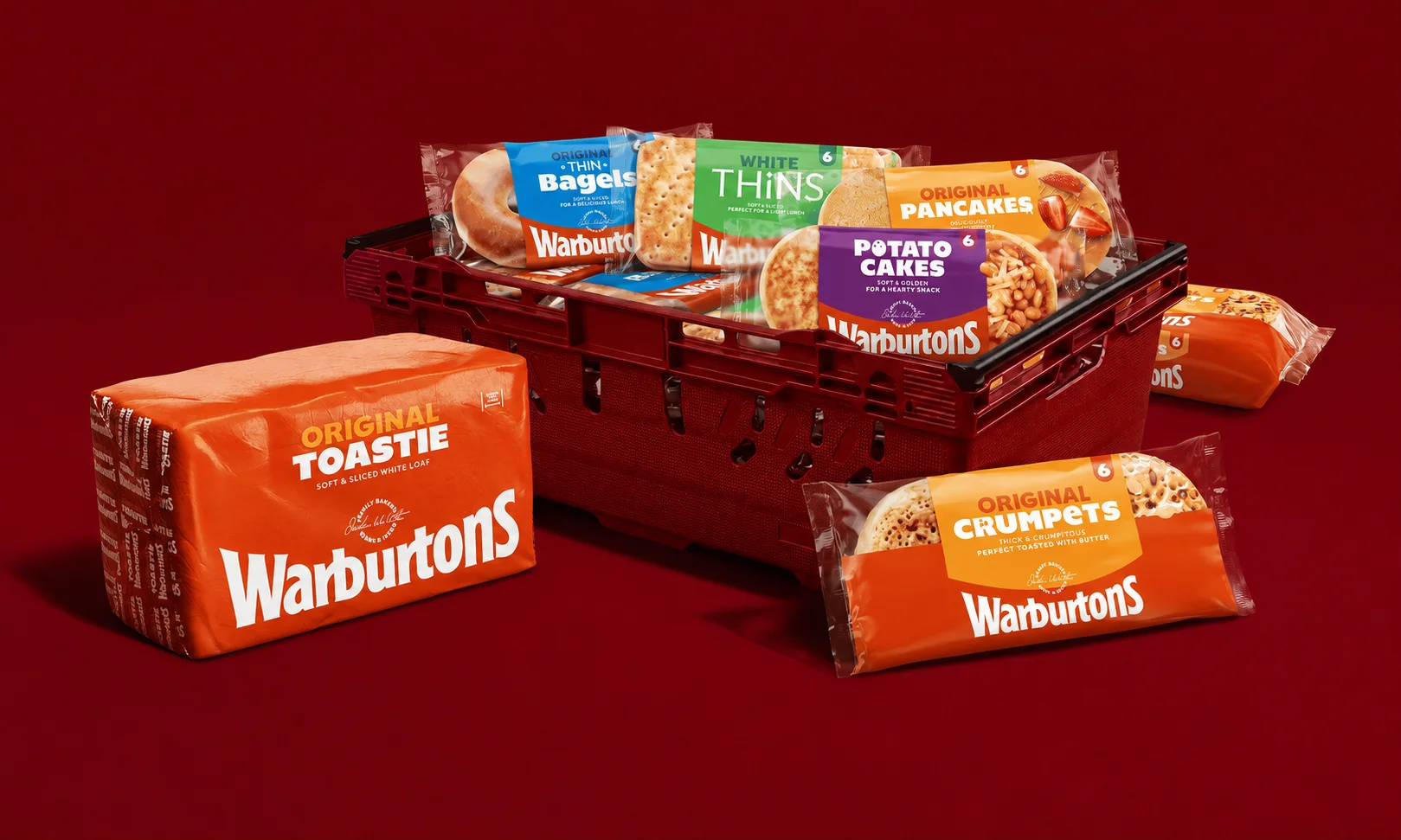
Warburtons and Bristol agency Taxi Studio did something more useful instead. They rebuilt the entire packaging system across 70+ products from sliced bread to crumpets to gluten-free rolls and made the thing everyone already associated with the brand impossible to miss.
The “Baked Orange” color, made famous by out-of-home advertising and the delivery fleet, got amplified. The wordmark was refined. Chairman Jonathan Warburton’s actual signature now appears on-pack alongside a “Family Seal of Quality.” Toasting products got a shining gold “150 years of toasting between 1876 and 2026” logo.
None of it invented anything new.
All of it said: this has been true for 150 years, and we’re not going to keep underplaying it.
The rebrand rolled out starting March 2026. Full distribution across the range is happening throughout the year.
House of Fraser FRASERS: Dropping Two Words
House of Fraser had been in an awkward spot for a while.
The name carried genuine recognition and real emotional weight for a huge slice of British shoppers of a certain age. But the thing it represented grand, formal, department-store retail had largely stopped existing.
Not a terrible reputation. Just the wrong one for where the business needed to go.
In March 2026, Frasers Group stripped it back.
The name became FRASERS. The “House of” is gone.
On paper that’s a minor edit. In practice it changes almost everything about what the brand can now be. The nostalgia stays. The stuffiness leaves. The name still means something, but it’s suddenly free to mean whatever the group decides to make it mean going forward.
This is the whole “subtraction” logic in one move.
Allica Bank: A Single Orange Bowler Hat
Here’s the rebrand that surprised the industry the most.
Allica Bank serves established SMEs the five-to-250 employee businesses that have been quietly abandoned by the big high street banks as branch networks shrink and relationship managers become memory.
The challenger bank space is supposed to look disruptive. It mostly looks like itself, repeated. Navy, teal, something called “coral” that nobody asked for. A sans-serif that signals “digital” without committing to anything.
Allica launched its rebrand in 2025 and it’s been building throughout 2026. The new identity is built around a single image.
A bright orange bowler hat.
That’s it. That’s the logo.
The bowler hat carries specific meaning in British business culture it’s shorthand for a certain kind of practical, no-nonsense professionalism. Allica turned that into a brand asset. The rest of the identity is built around confidently owning the visual.
For SME banking, it works. Because it stopped pretending to be a fintech and started looking like the bank its customers actually wanted.
Verizon: The Quiet Checkmark Refinement
Not every 2026 rebrand was radical.
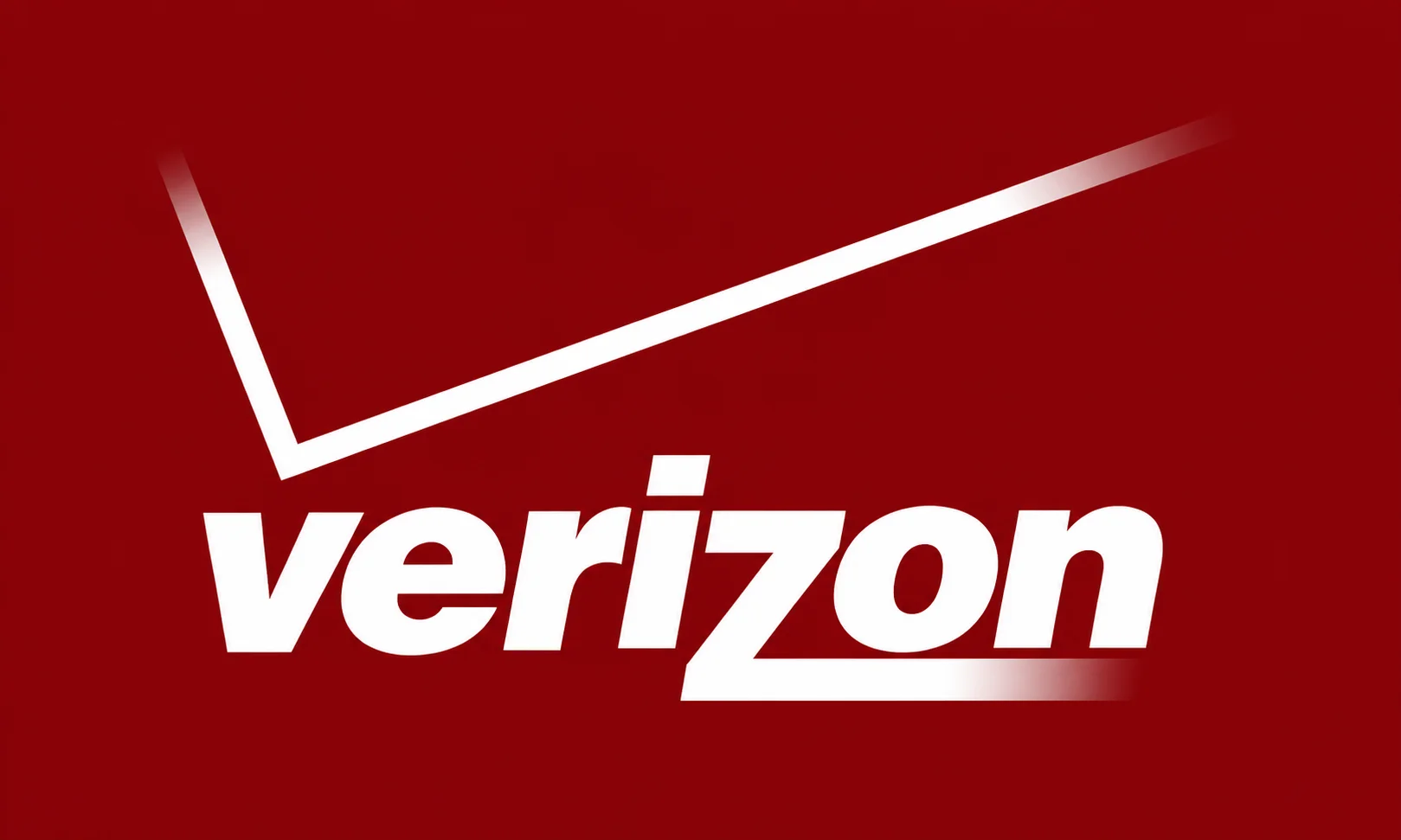
Verizon’s team refined its iconic checkmark for better clarity and impact in digital environments. The mark is now slightly bolder, slightly more defined, and holds its recognition at very small sizes which matters in a world where most brand interactions happen on a phone screen.
The strategic reasoning: as brands increasingly live in mobile app icons and social media favicons the size of a fingernail, subtle logo tuning is one of the most quietly important things a modern brand can do.
Not every rebrand needs to be a headline.
Why “Subtraction” Beat “Reinvention” in 2026
Look at the four rebrands above.
- Warburtons removed clutter and put its color forward
- House of Fraser removed the “House of”
- Allica removed every conventional financial services identity element and kept just a hat
- Verizon removed design noise from its checkmark
Every one of them worked by taking things away.
Compare that to the parade of failed rebrands over the last decade. Tropicana replaced its distinctive orange-with-straw packaging with a generic orange-juice glass. Gap tried a modernized logo and reverted within a week. Twitter became X. Jaguar transformed into a luxury EV brand and remains, two years later, still being debated as a case study in what happens when a rebrand throws away everything the audience recognized.
The pattern is consistent. When brands ditch the thing their customers actually recognized in favor of something “modern” and “considered,” they end up with something forgettable.
When brands ask what already exists here that we’ve been underplaying, they end up with something powerful.
That’s the whole lesson of 2026’s best rebrands. It’s not about creativity. It’s about paying attention.
What This Means For Anyone Rebranding Now
If your brand has any history, you probably already own more equity than you realize.
A color. A shape. A name. A phrase. A tone of voice. Something your audience associates with you specifically, even when you’re not sure they do.
The temptation with a rebrand is always to throw those away and start fresh. The evidence from 2026 says the opposite.
Before you rebrand, list the assets you already own. Then ask which ones you’ve been underusing. Then build the rebrand around amplifying those, not replacing them.
Sometimes the right rebrand adds one new thing a signature on the package, a bolder version of the existing color, a tightened wordmark. Sometimes the right rebrand just removes a word from the name.
Almost never is the right rebrand starting from scratch.
That’s the rule the best brands of 2026 are proving.
FAQs
What are the biggest brand rebrands of 2026?
Warburtons’ 150th-anniversary packaging redesign across 70+ products, House of Fraser becoming FRASERS, Allica Bank’s orange bowler hat identity, and Verizon’s checkmark refinement all stood out in the first half of the year.
What’s the biggest trend in 2026 rebranding?
Subtraction. Instead of inventing new brand assets, the best rebrands of 2026 removed clutter and amplified assets the brand already owned a color, a name, a signature, a shape.
Why did House of Fraser rename to FRASERS?
The Frasers Group dropped “House of” in March 2026 to modernize the brand while keeping its core recognition. The change preserves nostalgia while freeing the brand from associations with a traditional department-store model that has largely stopped existing.
Who designed the Warburtons rebrand?
Bristol-based agency Taxi Studio, working with Studio Drama on the new typeface family. The rebrand redesigned all 70+ products in Warburtons’ portfolio, rolling out from March 2026 onwards.
Why do most rebrands fail?
Because they try to reinvent the brand instead of using what it already has. The most memorable rebrand failures (Tropicana, Gap, Jaguar’s EV pivot) all involved throwing away the exact assets customers most recognized.