
Coca-Cola announced a new global brand identity on Monday July 20, 2026. Within hours, social media was not talking about Coca-Cola. It was talking about Marlboro.
The backlash was fast, loud, and funny in the way that only brand mistakes can be. Millions of people spotted a striking similarity between Coke’s new typeface and the font used on a pack of Marlboro cigarettes. The internet did what the internet does: it made memes, it made jokes, and it made Coca-Cola’s design team very uncomfortable.
AI Overview
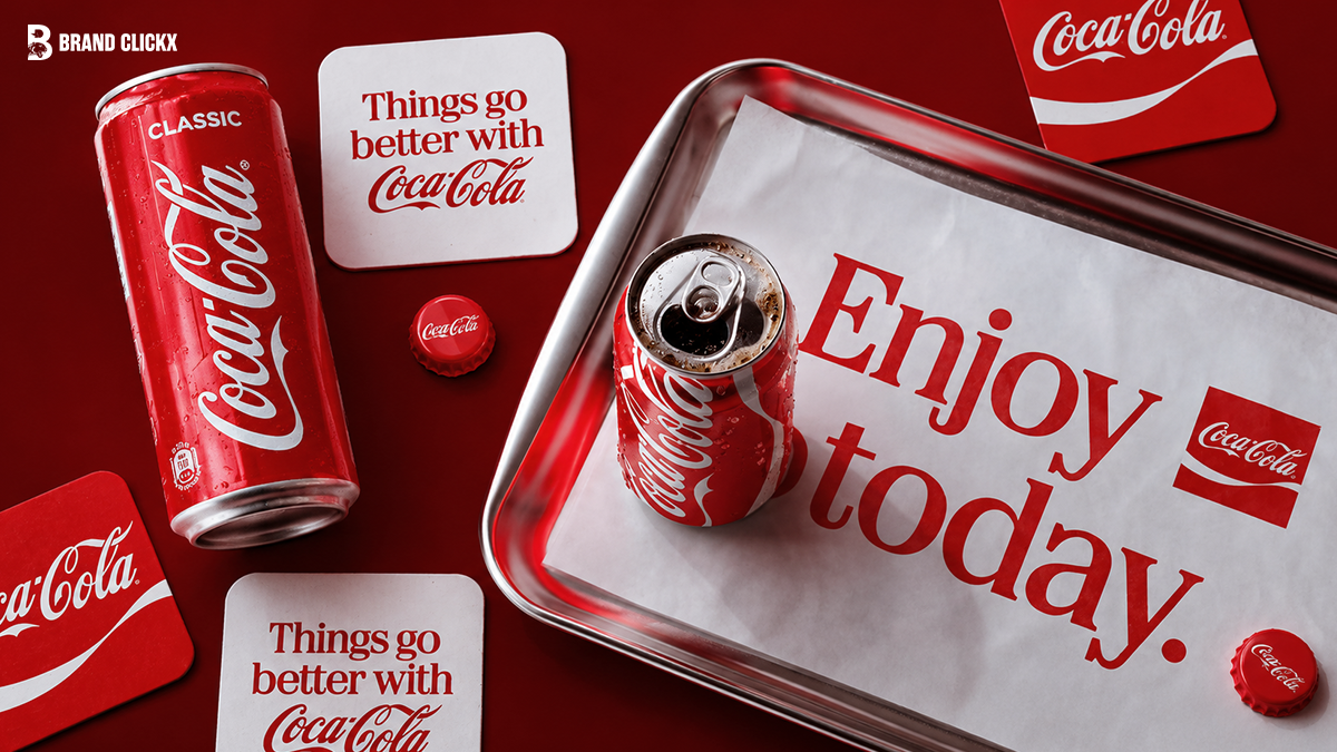
Coca-Cola launched a new “global visual identity system” on July 20, 2026, developed by global brand design agency JKR. The redesign included a subtle update to Coke’s famous Spencerian script logo and its “dynamic ribbon” design. The change that caused the controversy was a new complementary slab serif typeface called “Better With,” created by Brody Associates in 2023 and originally used for a holiday campaign. Coca-Cola made it a central part of its brand’s marketing and packaging as part of this wider refresh.
Social media users immediately compared “Better With” to the font used by Marlboro cigarettes. The two are not identical, but the visual similarity is strong, especially when the Coke font is rendered in the brand’s signature red and white colors. Those are also Marlboro’s colors.
Coca-Cola’s Global Brand Head Arnab Roy said the refresh was about “being clearer and more consistent” in how the brand shows up. The company has not directly addressed the Marlboro comparison. Critics and brand experts said the comparison was an avoidable mistake that showed a failure of design due diligence.
Key Facts
| Detail | Information |
|---|---|
| Announcement date | Monday, July 20, 2026 |
| What Coca-Cola called it | A “new global visual identity system” and “visual refresh” |
| Design agency | JKR (developed the overall identity system) |
| Typeface name | “Better With” |
| Who created the font | Brody Associates, in 2023 |
| When the font was originally made | 2023, for a Coca-Cola holiday campaign |
| What is new | “Better With” is now central to all marketing and packaging, not just one campaign |
| What the controversy is about | “Better With” looks very similar to the Marlboro cigarette typeface |
| Are the two fonts identical | No, but the resemblance is widely described as hard to unsee |
| Colors that make it worse | Both Coca-Cola and Marlboro use red and white as their primary brand colors |
| What else changed | A subtle update to the Spencerian script logo and the “dynamic ribbon” design |
| Coca-Cola’s official response | No direct comment on the Marlboro comparison |
| Roy quote | “This refresh is about being clearer and more consistent in how we show up” |
| Additional complaint | Some consumers said the redesign makes it harder to tell Coke Zero from regular Coke at a glance |
| Adult smoking rate in the US 1965 | About 42 percent |
| Adult smoking rate in the US 2022 | About 11 percent (American Lung Association) |
| Philip Morris parent company rebrand | Rebranded itself to Altria Group because the tobacco association became too toxic |
What Coca-Cola Actually Changed
Coca-Cola’s redesign was described by the company as a “visual refresh.” It was not a full rebrand in the way that many companies do where they change the logo and colors. The famous red, the Spencerian script, and the ribbon stayed.
Three things actually changed.
The Spencerian script: The handwritten cursive “Coca-Cola” logo that has existed since 1887 was given a subtle update. The changes were minor and most people would not notice them without a side-by-side comparison.
The dynamic ribbon: The curved red ribbon that flows beneath the logo, which has been part of Coke’s visual identity for decades, was refined.
The typeface: This is the change that caused everything. Coca-Cola elevated “Better With,” a slab serif font created by Brody Associates in 2023, to a central role in all brand communications. Words like “Delicious” and “Refreshing” are now displayed on packaging and in marketing materials in this typeface.
Brody Associates described the font when they made it: “We were asked to craft a new serif font family to express the brand’s unique personality, movement, and playfulness. Inspired by the company’s archive, we blended Coca-Cola’s rich serif font heritage with modern-day requirements, adding another layer of storytelling to the brand through typography.”
Why It Looks Like Marlboro
The two fonts are not the same. Designers and typographers who looked closely said they come from the same broad category of slab serif typefaces but are distinct designs. However, the visual similarity at a quick glance is hard to deny.
Several factors made the similarity worse than it might have been in a different context.
The colors. Coca-Cola’s brand colors are red and white. Marlboro’s brand colors are red and white. When you see a bold slab serif typeface in red and white, with angled stress and thick-to-thin contrast, your brain reaches for the most famous example of that combination, which is Marlboro.
The weight and angle. Both typefaces have similar visual weight, similar condensed proportions, and a similar feeling of confidence and boldness. Put them side by side in Coke’s red and white and the resemblance compounds.
The cultural context. Marlboro is not just a cigarette brand. It is one of the most visually distinctive brands in the history of advertising. The Marlboro Man campaign ran for decades and burned the combination of that typeface, red, and white into cultural memory at a mass scale. When something looks like Marlboro, people notice.
Creative Bloq described the font as “not the same font, but the similarity is undeniable.”
What Social Media Said
Social media reactions ranged from jokes to genuine criticism.
One person on X wrote: “Love that they just leaned into the fact that soda is the new cigarettes by just straight up doing the Marlboro font.”
On Threads, one person wrote: “Coca Cola was the gold standard of branding that leaves a legacy. And then Coca Cola suddenly popped out with Marlboro’s typeface. Get me off this timeline now.”
Another wrote: “Is Coca Cola rebranding like that because we all started calling em fridge cigarettes?”
One person posted: “If she didn’t instantly recognize the Coke rebrand as the Marlboro font, she’s too young for you.”
Gizmodo noted that one user wrote: “The typeface looks very similar to Marlboro,” which was described as “a common response.”
Multiple posts included fan-made mock-ups showing what a Diet Coke can would look like with full Marlboro-style branding. These spread widely.
Unilad Tech described the reaction as pointing out the irony of “a sugary soft drink appearing to borrow cues from one of the most famously addictive products in the world.”
The Second Complaint: Harder to Read at a Glance
Alongside the Marlboro comparison, a separate but related complaint emerged. Some consumers said the redesign makes it harder to distinguish between Coke’s different product variants, particularly Coke Zero and regular Coke, when grabbing something quickly from a refrigerator.
One person posted: “Hey Coca-Cola, why do you insist on making it more difficult to tell Coke Zero from regular Coke at a glance? I’m not even diabetic but that seems like a dangerous thing to do.”
This second criticism touches on a real accessibility and usability concern. People with diabetes and other health conditions often need to quickly identify sugar-free versus regular drinks. A redesign that makes that distinction less clear is a practical problem, not just an aesthetic one.
What Brand Experts Said
Adweek covered the story with a brand strategy analysis. Creative director Jon Arriaza of Chase Design Group said in the Adweek piece: “Whether they consciously notice them or not, well-known brands have an amazing ability to trigger memories and emotional responses. With brands that own a very strong brand color, it’s upon us as creators and designers to do diligence and look at other brands that own a similar color.”
Adweek noted that the same diligence applies to typeface choices. A strong slab serif in red and white is not a neutral choice. It carries associations, and the most powerful association it carries in Western consumer culture is Marlboro.
Gizmodo added the historical context that made the comparison sting. Adult smoking rates in the United States were around 42 percent in 1965. By 2022, according to the American Lung Association, that rate had fallen to about 11 percent. The tobacco industry became so culturally toxic that Philip Morris’s parent company rebranded itself as Altria Group to distance itself from the association. For a beverage company to voluntarily adopt a visual identity that reminds people of cigarettes is, as Gizmodo put it, “a little odd.”
What Coca-Cola Said
Coca-Cola’s Global Brand Head Arnab Roy made a statement when the refresh was announced: “Coca-Cola is one of the most recognized brands in the world, and with that comes a responsibility to keep evolving. This refresh is about being clearer and more consistent in how we show up, wherever people experience our brand. By building on the things people already know and love, we are creating a stronger foundation for growth while staying unmistakably Coca-Cola.”
The company did not respond to questions about the Marlboro comparison when contacted by Gizmodo on Monday. As of the time of this article’s publication, Coca-Cola had not issued a direct public statement addressing the comparison.
The Brand Strategy Lesson
For brands and marketing professionals, the Coke-Marlboro story is a reminder of how much visual memory matters in brand design.
When consumers interact with a brand’s visual identity, they do not evaluate it in isolation. They compare it to everything else they have seen in their lives. Coca-Cola’s designers and agency partners presumably tested this typeface extensively. But the fact that the Marlboro comparison was immediately obvious to millions of ordinary people within hours of launch suggests that some form of association testing against competitive and adjacent brands either did not happen or did not weight cultural memory sufficiently.
Jon Arriaza’s advice, as quoted by Adweek, applies here: color and typeface carry memories. In red and white, a bold slab serif font is not a blank slate. It arrives loaded with associations. For the world’s most famous beverage brand, arriving in a package that triggers associations with the world’s most famous cigarette brand is a problem that no amount of good intentions in the design brief can undo.
FAQs
What did Coca-Cola change in its 2026 rebrand?
Coca-Cola made three changes: a subtle update to its Spencerian script logo, a refinement of its “dynamic ribbon” design, and the elevation of a typeface called “Better With” to a central role in all brand marketing and packaging. The typeface change caused the controversy.
What is the “Better With” typeface?
A slab serif font created for Coca-Cola by Brody Associates in 2023, originally for a holiday campaign. In the July 2026 refresh, it became a core part of Coke’s brand identity system, used for words like “Delicious” and “Refreshing” on packaging.
Why does the Coke font look like Marlboro?
The two typefaces are both bold slab serifs with similar visual weight and proportions. When rendered in red and white, which are both Coke’s and Marlboro’s primary brand colors, the visual resemblance becomes particularly strong to most viewers.
Are the Coca-Cola and Marlboro fonts the same?
No. Designers who examined them said they are distinct typefaces from the same broad category of slab serifs. However, the visual similarity at a quick glance is widely described as hard to ignore.
Did Coca-Cola respond to the Marlboro comparison?
No. Coca-Cola did not respond to questions about the Marlboro comparison when contacted by Gizmodo after the announcement. The company has not issued a direct public statement addressing the comparison.
Who developed the Coca-Cola rebrand?
The overall “global visual identity system” was developed by JKR, a global brand design agency. The “Better With” typeface was created by Brody Associates in 2023.