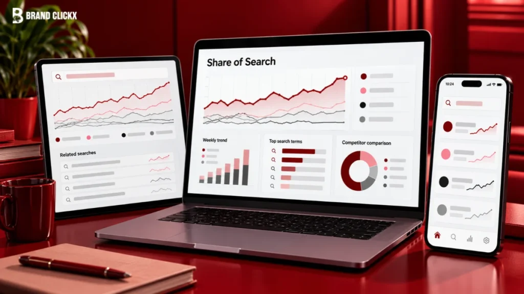

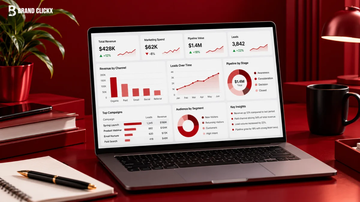
You know that dashboard everyone asked for, everyone helped build, and almost nobody opens? Yep, that one.
It usually starts with good intentions. Marketing wants to show performance. Sales wants pipeline. Finance wants spend. Leadership wants “the big picture.” So the team keeps adding charts until the dashboard technically contains everything and practically tells nobody anything.
Here’s the thing: good marketing dashboard design is not about squeezing more data onto one screen. It is about helping an executive understand what matters before they move on to the next meeting. This article uses one simple test from start to finish: can the dashboard do its job in one minute?
If not, something needs to go.
Key Takeaways
- Build around 3 questions: Are we on track? What changed? Does anything need a decision?
- Apply the one-minute test to every chart and metric.
- Put decision-critical information on the dashboard and move supporting detail elsewhere.
- Always show context, comparison, and thresholds instead of isolated numbers.
- Review the dashboard every quarter and follow one rule: add one, remove one.
The three questions a dashboard answers
A useful executive dashboard should answer 3 questions almost immediately: Are we on track? What changed? Does anything need a decision?
That is really the whole job.
“Are we on track?” tells the executive where things stand against a target or expected range. “What changed?” points out something worth noticing. And “Does anything need a decision?” tells them whether they need to approve something, investigate something, shift resources, or simply keep watching.
Everything else is supporting analysis.
This is also where a dashboard differs from a scorecard. A scorecard is mainly about tracking performance against agreed goals or objectives. A dashboard is more of a live decision view: what is happening right now, what moved, and where should I look?
The important bit is not to turn the dashboard into that article. Keep the dashboard focused on what an executive needs to see quickly.
If a chart needs a paragraph underneath it to explain why it matters, it probably belongs in the monthly report instead.
The one-minute test
Let’s be realistic. An executive might spend anywhere from 30 seconds to 2 minutes looking at a dashboard.
You could design for the 2-minute version. But why would you?
Design for 30–60 seconds.
That immediately removes a lot of the usual dashboard clutter: charts with huge legends, graphs with 10 different lines, tiny labels, and visuals where you have to remember whether “up” is actually good.
Research on data visualization has repeatedly found that some visual encodings make comparisons easier than others. Position and length, for example, are generally easier to compare than more complicated visual forms such as area or angle.
That matters because executive reporting marketing should not require the executive to become an analyst.
If pipeline is behind target, make that obvious.
If acquisition costs increased, show the change.
If performance is normal, make that obvious too.
And don’t fall into the trap of thinking that more charts automatically mean more useful information. A dashboard with 20 tiny charts can contain far more data than one with 8 clear metrics, while still being much harder to understand.
The one-minute test is your filter.
If a chart cannot explain itself quickly, it has some explaining to do.
Step one: Write the question above every chart
This might sound almost too simple, but it is probably the cheapest improvement you can make to an existing dashboard.
Write a question above every chart.
Not a label. A question.
Instead of:
Website sessions by channel
Try:
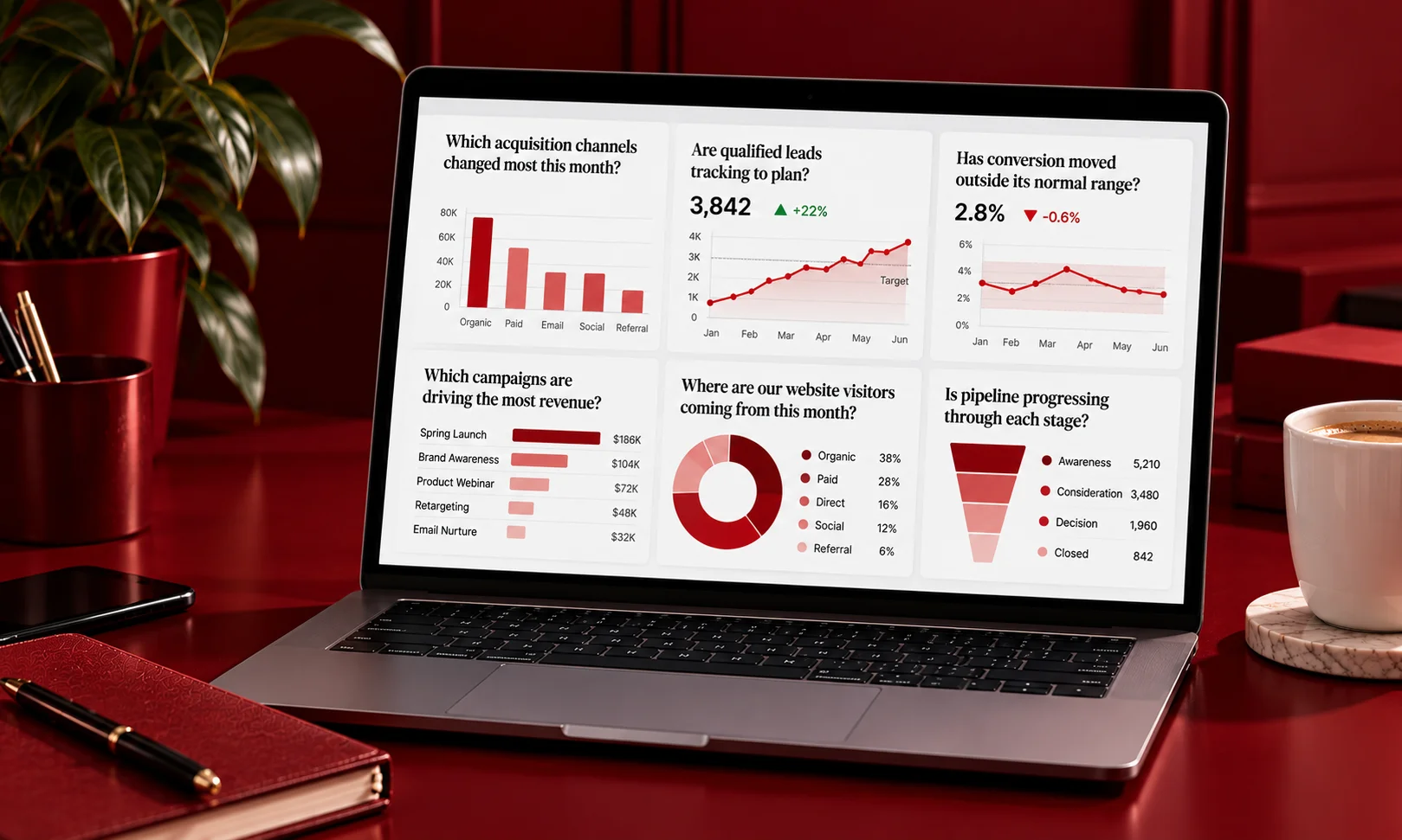
Which acquisition channels changed most this month?
Instead of:
MQL volume
Try:
Are qualified leads tracking to plan?
Instead of:
Conversion rate
Try:
Has conversion moved outside its normal range?
See the difference?
The question forces the chart to have a job.
If you cannot write a simple question, remove the chart. If 2 charts answer basically the same question, remove one of them. And if the question is not something an executive actually needs answered, move it somewhere else.
Honestly, this is where a lot of dashboard cleanup should start.
Most dashboards grow because people keep asking for “just one more thing.” Someone wants paid search. Someone else wants email. Sales wants leads. Finance wants spend. Then somebody adds campaign-level data because it “might be useful.”
Before you know it, the dashboard has become a storage room.
Start with questions instead of data, and you can cut a surprising amount without losing anything important.
Step two: Decide what goes where
Not every useful marketing metric deserves a place on the executive dashboard.
Give every metric one of 3 destinations:
- Dashboard: Important enough to monitor quickly.
- Monthly report: Useful, but needs context.
- Deep dive: Helpful when someone needs to investigate a problem.
That distinction makes the dashboard much easier to manage.
So, what should actually be on a marketing dashboard? Here is one practical way to sort 20 common metrics:
| Metric | Destination | Why |
| Marketing-sourced revenue | Dashboard | Direct business outcome |
| Marketing pipeline | Dashboard | Shows business contribution |
| Pipeline vs. target | Dashboard | Answers “are we on track?” |
| Marketing spend | Dashboard | Executive resource view |
| Customer acquisition cost | Dashboard | Efficiency signal |
| Qualified leads | Dashboard | Current funnel health |
| Lead-to-opportunity rate | Dashboard | Conversion health |
| Website conversions | Dashboard | Demand signal |
| Organic traffic | Dashboard | Useful high-level trend |
| Paid media ROAS | Dashboard | Investment efficiency |
| Channel-level CPL | Monthly report | Needs more comparison |
| Campaign conversion rate | Monthly report | Better with campaign context |
| Email open rate | Monthly report | Useful channel detail |
| Email click rate | Monthly report | Diagnostic detail |
| Social engagement rate | Monthly report | Needs context |
| Landing-page conversion by page | Monthly report | Optimization detail |
| Keyword-level rankings | Monthly report | Too granular for executives |
| Creative-level performance | Deep dive | Diagnostic |
| Audience-segment performance | Deep dive | Requires analysis |
| Ad-set/campaign-level data | Deep dive | Operational investigation |
There is no magic number of metrics that works for every company. But if the executive has to scroll through several screens to understand what is happening, you probably have too many.
A good kpi dashboard is not the one with the most KPIs.
It is the one with the fewest KPIs needed to answer the important questions.
Step three: Show change rather than state
A number on its own is surprisingly unhelpful.
Say your dashboard shows:
Pipeline: $4.2M
Okay. Is that good?
Maybe.
Is it $400K above target? $200K below target? 15% higher than last month? Completely normal for this point in the quarter?
You have no idea.
That is why every important number needs context.
At minimum, ask:
- What are we comparing it with?
- What period are we looking at?
- What was the target?
- How big is the change?
- Is this movement normal?
- Is the data complete?
The right comparison depends on the metric. Sometimes it is month over month. Sometimes it is year over year. Sometimes it is against a target, rolling average, forecast, or expected range.
Ranges can be particularly useful.
A conversion rate dropping from 3.4% to 3.1% might look worrying if you only see the 2 numbers. But if normal performance sits between 2.9% and 3.6%, nothing unusual has happened.
On the other hand, a small change can matter if it pushes performance outside the normal operating range.
And don’t forget data freshness. Google Analytics notes that different datasets can have different processing intervals, while Google Ads also uses different refresh schedules for different metrics.
So, yes, show the number.
But also show what the number means.
Don’t make the executive do the comparison in their head.
Step four: Make the bad news findable
Here is an uncomfortable truth: a dashboard that is always green eventually becomes invisible.
If everything looks fine every single week, people stop looking.
That does not mean you should turn the dashboard into a wall of red. It means the dashboard needs clear thresholds for what deserves attention.
Before publishing a metric, decide:
What is normal?
What needs investigation?
What requires a decision?
The people responsible for the metric should help define those thresholds. And the thresholds should connect to an actual action.
For example, a team might decide that a sustained conversion decline outside the normal range triggers an investigation. A significant marketing-spend variance might trigger a budget review.
The tricky part is that bad news can feel uncomfortable on an executive-facing page.
Nobody wants to be the person whose chart suddenly turns red in front of leadership.
But hiding the bad news does not fix the problem. It just delays the conversation.
So make exceptions visible, keep the definitions consistent, and make it clear what happens when a threshold is crossed.
Red should mean look here, not someone is in trouble.
That small distinction can make dashboards much more useful.
Step five: Agree who owns and maintains it
A dashboard without an owner usually starts falling apart within 2 quarters.
At first, everything works. The data connects. The charts look nice. Everyone is happy.
Then a metric definition changes.
A data source gets replaced.
Someone changes the reporting window.
A connector breaks.
Nobody updates the dashboard.
And suddenly people are asking, “Wait, where did this number come from?”
Someone needs to own the dashboard.
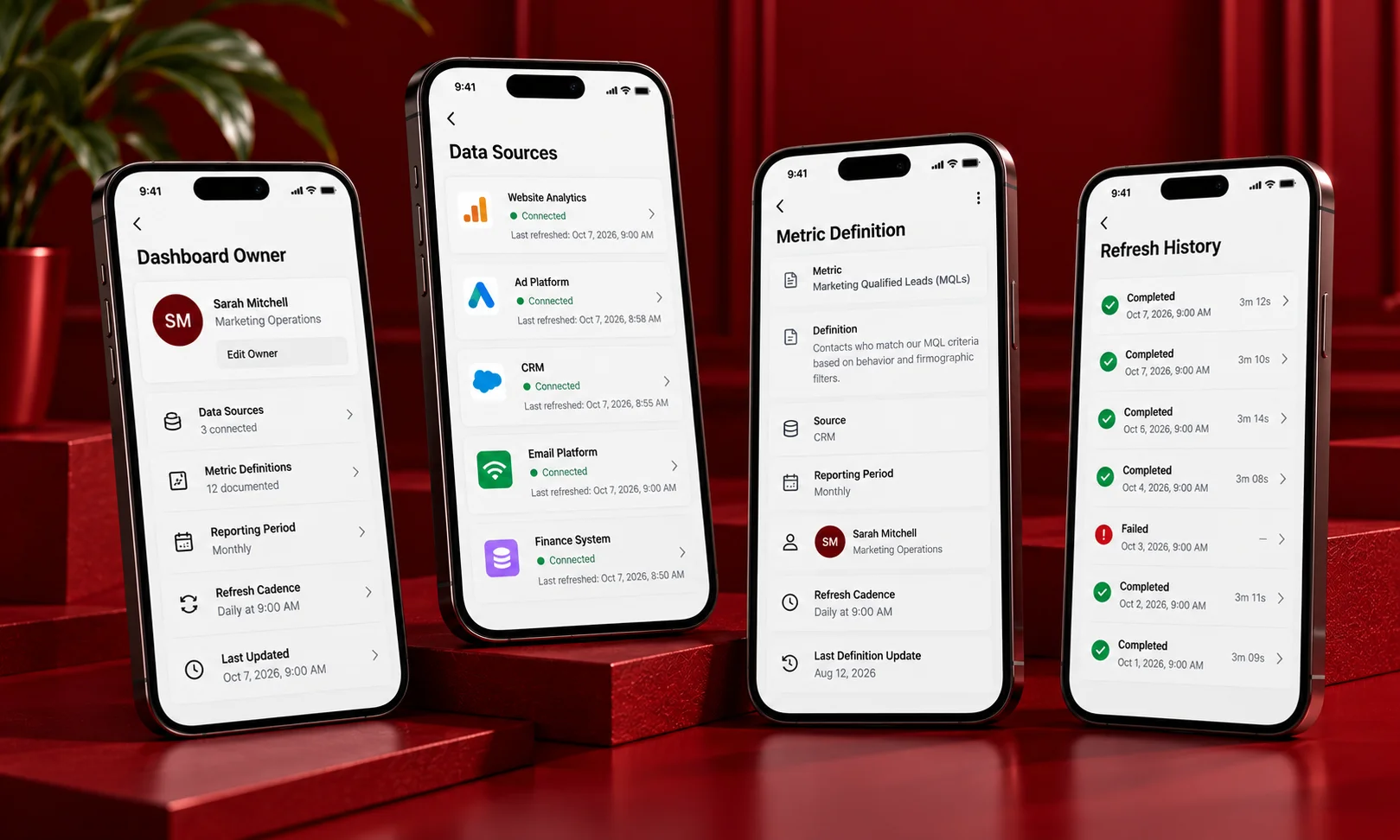
That person should know where the data comes from, how often it refreshes, who owns each metric, and what happens when definitions change.
This is where marketing operations matters.
Document the source, definition, reporting period, owner, and refresh cadence for every important metric. If the definition changes, record when it changed. Don’t quietly mix old and new definitions and hope nobody notices.
Also, don’t confuse more frequent refreshes with better reporting. If executives make decisions weekly, a dashboard refreshing every few minutes may simply create noise.
Platform documentation reflects this complexity. Microsoft, for example, distinguishes data refresh from visual refresh in Power BI and provides refresh history so teams can monitor refresh failures.
Tool adoption matters too.
If nobody trusts the dashboard, nobody will use it.
And if 5 tools produce 5 slightly different versions of the same metric, you have a stack rationalisation problem, not a chart problem.
For the broader operating side of this, see the [Day 3 Post 4 operations piece].
How to kill a chart
This is probably the part most dashboard guides skip.
Dashboards keep growing because nobody wants to remove anything.
Adding is easy.
Removing is political, awkward, and sometimes surprisingly emotional.
Someone asked for that chart six months ago. Someone else might need it someday. So it stays.
Then another chart gets added.
And another.
And another.
Eventually, the dashboard becomes the exact thing it was supposed to replace: a giant reporting document.
Run a dashboard review every quarter.
For every chart, ask:
- Is anyone using it?
- What question does it answer?
- Has it influenced a decision?
- Is the information duplicated somewhere else?
- Would removing it make the dashboard harder to use?
If the answer to the last question is no, remove it.
Check usage data when your platform provides it. A chart being rarely viewed does not automatically mean it is useless, but it is certainly worth questioning.
And use this rule:
Add one, remove one.
Want a new chart?
Fine. Which existing chart is leaving?
That one rule prevents the dashboard from becoming a junk drawer.
And honestly, your dashboard should probably get smaller over time, not bigger.
The read
Are executive dashboards worth building?
Yes, when leaders repeatedly need the same performance information and can use it to make decisions quickly.
But a dashboard is not automatically better than a written update.
Sometimes a short weekly note explaining what changed, why it changed, and what needs attention is much more useful than another screen full of charts.
The difference is attention.
If the information needs explanation, give it explanation. If it needs monitoring, give it a dashboard.
So open your dashboard today and find the chart you are least sure anyone uses.
Remove it.
Seriously.
If someone genuinely needs it, they will ask for it back.
If nobody notices, congratulations. You just made the dashboard easier to use without losing anything that mattered.
That is what marketing dashboard design should really be about: not showing everything marketing knows, but making the few things leadership needs impossible to miss.