
Tropicana changed its orange juice packaging in January 2009 because the brand wanted a more modern expression. Within weeks, sales of the affected product had fallen sharply, and the company abandoned the new package. A 2011 academic study found the redesign had a measurable negative effect on Tropicana orange juice demand.
That is what makes failed rebrand examples useful. The interesting question is not whether people disliked a logo. It is whether the rebrand solved a real business problem, protected existing brand equity, and produced a measurable improvement. The best-known failures show that a polished identity can still be the wrong business decision.
If you have not read our earlier analysis, Rebrands That Worked: Successful Rebrand Examples and the Reasoning Behind Them is the companion piece.
The pattern is surprisingly consistent: the failures were not necessarily ugly. They were uninformed.
Key Takeaways
- A rebrand can trigger backlash without actually failing commercially.
- The most dangerous change is often the one that removes recognition without replacing it.
- A rebrand needs a measurable business problem, not just a desire to look newer.
- Brand assets should be treated as accumulated commercial assets, not decoration.
- The quietest failures are the ones that spend heavily without changing business performance.
Unpopular Is Not the Same as Failed
A rebrand backlash is not proof that a rebrand failed. People routinely dislike unfamiliar identities at launch, particularly when a familiar visual asset has been used for years. Some controversial changes eventually settle into the market without damaging the underlying business.
That means launch reaction is only an early signal. The stronger test is what happens after the announcement: Does recognition hold? Does consideration improve? Does the new positioning become clearer? Do sales, market share, acquisition, retention, or another agreed business measure move?
That is the difference between creative criticism and marketing effectiveness.
For this analysis, a rebrand counts as a meaningful failure when there is evidence of at least one of three things: the company reversed or materially changed the decision, the rebrand coincided with a documented deterioration in a relevant commercial measure, or the stated strategic objective was not achieved and the company subsequently changed direction.
That standard matters because it stops the article becoming a collection of ugly-logo stories. A design can be unpopular and commercially successful. It can also be attractive, well executed and commercially pointless.
The Cases, and What Actually Went Wrong
Tropicana changed recognition cues without replacing them
Tropicana’s 2009 redesign was intended to modernize the brand and make the packaging feel more contemporary. The new system replaced the familiar orange-and-straw image and changed several recognition cues on the carton.
The deeper problem was not aesthetics. The package was doing recognition work at the shelf, and the redesign weakened that function. Sales of Tropicana Pure Premium were reported to have fallen about 20% within weeks, after which the company restored the previous packaging. A 2011 academic study separately examined the economic effect of the redesign rather than treating online reaction as the evidence itself.
The cost therefore included the redesign and rollout, lost sales and the expense of reversing the packaging. Trade reporting put the redesign and advertising investment at about $35 million, although PepsiCo did not publish a single official figure for the total cost of the episode.
Gap changed a valuable asset without a convincing reason
Gap said its 2010 logo change was part of a broader effort to modernize the brand as its products evolved. The problem was that the blue-box logo already carried substantial recognition, while the company did not provide a strong customer-facing reason for replacing it.
The new mark lasted roughly a week. Gap returned to the original logo on October 11, 2010, explicitly acknowledging that it had not handled the change correctly.
The commercial evidence needs care here. Gap was already experiencing pressure in its core North American business, and its fiscal 2010 North American Gap comparable-store sales were down 1%. Fiscal 2011 net sales also fell from $14.7 billion to $14.5 billion. Those figures cannot be attributed solely to the logo episode.
What can be attributed directly is the failed rollout and reversal.
Consignia changed the name while customers still needed the old meaning
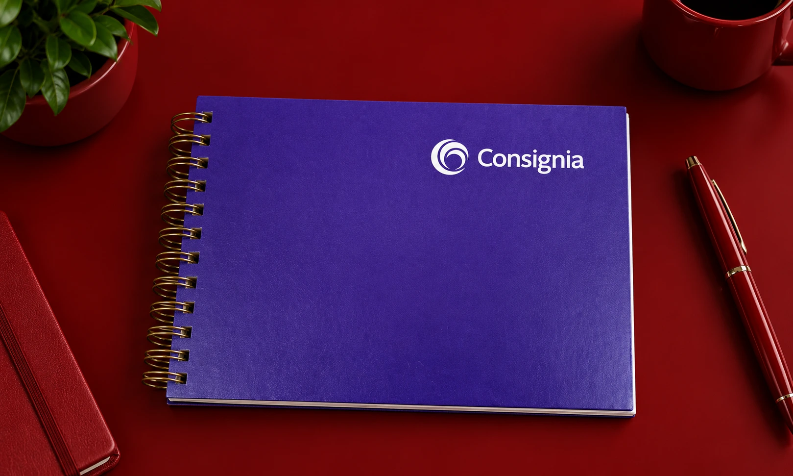
In 2001, the UK’s Post Office became Consignia as part of a move to present the organization as a broader commercial and international operator. Government records said the name had been researched for a modern postal operator and was intended mainly for integrated and international business users.
The problem was positioning. The new name communicated corporate ambition more clearly than it communicated what the organization actually did.
The name was abandoned roughly 15 months later. Parliament was told that implementation of the new identity had cost less than £2 million, while contemporary reporting put the reversal at about £1 million.
The business was also suffering much larger operational problems, including a £1.1 billion pre-tax loss in the year before the reversal. It would be wrong to attribute that loss to the rebrand. The useful evidence is narrower: the new name failed to establish a useful position, cost money to reverse and was removed while the organization was trying to restructure the business.
JCPenney changed the customer proposition, not just the logo
JCPenney’s 2012 transformation went far beyond identity. The retailer wanted to become “America’s favorite store” and introduced a new pricing model, new promotional structure, new personality, new logo and major changes to merchandise and store presentation.
The deeper problem was that the new positioning disrupted an established reason customers had to shop there. JCPenney moved away from its familiar promotional model toward “Fair and Square” pricing, while simultaneously changing other parts of the customer experience.
The commercial result was severe: comparable-store sales fell 25.2% in fiscal 2012 and total net sales fell 24.8% to $12.985 billion.
The company then moved back toward a promotional model and edited its merchandise strategy. In fiscal 2013, comparable-store sales improved sequentially, with the fourth quarter producing the company’s first quarterly comparable-store sales gain since the second quarter of 2011.
The lesson is not “never change pricing.” It is that a rebrand cannot be separated from the customer proposition it represents.
The Four Checks Each of Them Missed
The companion article’s Rebrand Decision Test gives the useful lens. The same four checks expose different problems in these cases.
| Check | Tropicana | Gap | Consignia | JCPenney |
| Was there a real business problem? | Modernization was clear, but recognition risk was underweighted. | The brand wanted modernization, but the logo change did not address the deeper retail challenge. | The business needed broader commercial positioning, but the new name did not make the proposition clearer. | There was a genuine turnaround problem, but the solution changed too many customer cues at once. |
| What was deliberately not changing? | Too few familiar package cues survived. | The most recognizable logo element was removed. | The familiar corporate name was discarded. | The promotional value proposition customers understood was weakened. |
| Were distinctive assets preserved? | No: the orange-and-straw cue was weakened. | No: the blue box was removed. | No: “Royal Mail” equity was sidelined at corporate level. | The logo changed alongside pricing, promotion, stores and merchandise. |
| Was rollout treated as longer than an announcement? | The shelf impact exposed the problem quickly. | The rollout was reversed within days. | The organization reversed the name after about 15 months. | The transformation required sustained execution, but performance deteriorated before the strategy could establish itself. |
The pattern is important. These were not four versions of the same mistake. The same diagnostic framework catches four different forms of strategic overreach.
The Failure Mode Nobody Talks About
The most common failed rebrand may be the one nobody remembers.
There is no viral backlash. No executive apology appears in the news. The logo survives. The agency receives its final payment. Six months later, the business is essentially where it started.
That is a harder failure to spot because there is no dramatic event to force a review.
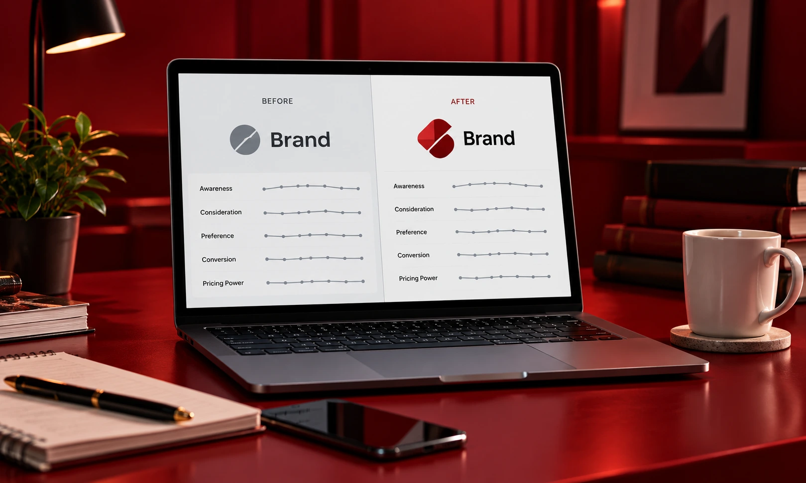
A rebrand can quietly do nothing when the original business problem was never clearly defined. If leadership cannot establish a baseline for awareness, consideration, preference, conversion, pricing power or another meaningful measure, the team can always argue that the new identity is “working” because people have seen it.
That is where brand tracking matters. Ongoing measurement can show whether perceptions are moving rather than relying on launch-week sentiment.
The same applies to category entry points. A brand needs to remain easy to recognize and easy to retrieve in buying situations. Ehrenberg-Bass research emphasizes the role of distinctive assets and category entry points in building mental availability over time.
No backlash does not mean the rebrand worked. Sometimes it simply means nobody noticed.
Why They Get Approved Anyway
Most rebrand failures do not require incompetent people. They require reasonable incentives pointing in the wrong direction.
A new CEO or CMO may want to demonstrate that the organization is moving. A large identity project creates visible evidence of change: new guidelines, new campaigns, new offices, new packaging and a launch moment.
Agencies also have an understandable incentive to solve a bigger problem with a bigger project. A strategic repositioning may genuinely require a new identity. But a visually impressive proposal can make it difficult for an internal team to ask a simpler question: what business result will this actually change?
Measurement creates another problem. If the company has no reliable baseline, leadership cannot easily prove that the old brand was holding the business back.
And short leadership cycles can encourage visible action over long term brand building. Brand tracking, distinctive assets and category entry points are inherently cumulative. They require consistency long enough for the market to learn the new meaning.
The issue, then, is not that leadership teams are too obsessed with logos. It is that a logo is easier to approve than a five-year positioning problem.
How to Catch It Before Launch
A five-question pre-mortem
- What business problem is this rebrand solving?
Write the problem in one sentence. If the answer is “we look dated,” keep digging. - What are we deliberately keeping?
Name the customer associations, products, promises and visual assets that still have value. - What does the baseline look like?
Record current awareness, consideration, preference, sales, market share and relevant brand-health measures before changing anything. - Which distinctive assets are being protected?
Test the logo, colors, shapes, packaging cues, typography and other recognition signals before removing them. Distinctive assets can build recognition over years and should not be discarded casually. - What would tell us in six months that the rebrand failed?
Agree on the failure signals before launch. Otherwise, teams tend to redefine success after the results arrive.
That last question is the one most brand relaunch mistakes avoid. A pre-mortem makes the uncomfortable outcome explicit before anyone has invested millions in making the new identity look inevitable.
The Read
The evidence does not support a clean claim that rebrand failure is either rising or falling. There is no reliable industry-wide failure rate that lets marketers make that statement confidently. What has changed is the ability to diagnose failure earlier: modern brand tracking can combine perception, recognition and commercial measures rather than relying on launch reaction alone.
At the same time, the pressure to demonstrate visible progress has not disappeared. Short leadership cycles, faster marketing timelines and constant pressure for novelty can make long term brand building harder, not easier.
That makes the central lesson from these failed rebrand examples fairly simple.
The question before a rebrand is not, “Can we create something better?”
It is: “What evidence says the brand needs to change, and what evidence will prove that changing it made the business better?”
If leadership cannot answer both, why approve the rebrand?
Stay informed: Subscribe to the BrandClickX newsletter for the latest brand, marketing and CMO analysis.