


Conversion Rate Optimization Audit: Loads of websites pull in solid traffic and still can’t turn it into actual business. People show up, click around for a while, then just leave no purchase, no booking, nothing filled out. And most of the time, it’s got nothing to do with how much traffic you’re getting. Somewhere along the way, visitors lose track of what to do, stop trusting what they’re looking at, or just aren’t sure what step comes next.
That’s basically what a CRO audit is for. Rather than guessing which button color to change or which headline to tweak, you look at the whole journey a customer takes and figure out exactly where people are falling off.
This guide from BrandClickX walks through a practical way to run that kind of audit how to spot conversion problems, figure out what’s causing them, and decide what’s worth fixing first.
So What Actually Is a CRO Audit?
It’s a structured look at a website, landing page, funnel, or store, aimed at finding whatever is stopping visitors from taking the action you actually want them to take.
That “action” might be a purchase, a form submission, a quote request, a booking, a download, or a sign-up depends on the business.
A good audit doesn’t rely on gut feeling. It brings together your website data, how people actually behave once they’re on the page, and an actual hands-on look at the site itself. And this is worth saying clearly: CRO isn’t about making a page look nicer. It’s about understanding what people genuinely need and getting rid of whatever’s standing in their way.
Key Takeaways
- Nail down your conversion goal before you do anything else
- Double check your analytics are even tracking things correctly
- Look at the whole journey, not just one page in isolation
- Make sure your value proposition is obvious, not implied
- Cut friction out of forms and checkout
- Actually test how the site behaves on mobile
- Pay attention to how users behave and what they say
- Turn what you find into clear, testable hypotheses
- Prioritize based on impact, evidence, and effort not gut feeling
- If a test fails, treat it as data, not a dead end
First, Get Clear on Your Conversion Goal
Before you even open the site, figure out what “success” looks like for your business.
Most sites have more than one possible goal, but your audit needs to focus on the one that matters most.
A few examples:
- An online store probably cares most about completed purchases
- A service business is likely chasing qualified leads
- A SaaS company might be watching free trial sign-ups or paid subscriptions
- A content site might care about newsletter subscribers
It also helps to separate the big conversions from the smaller ones. A button click is nice, but it’s not worth the same as an actual sale don’t treat them equally.
Once you know the goal, map out the path someone takes from their first visit to that final action.
Check Your Analytics Before You Trust Them

CRO decisions are only as good as the data behind them. Before you start chasing numbers, make sure your tracking is actually working the way you expect.
Make Sure Your Tracking Actually Works
Before you trust any of your numbers, go through your analytics and check whether the important events and conversions are actually logging consistently. Look for odd gaps, duplicate entries, traffic sources that just disappear, or sudden spikes and drops that don’t make sense. A lot of the time these aren’t real shifts in user behavior at all they’re just tracking glitches.
Look at Where People Drop Off in the Funnel
Next, map out the steps someone takes before actually converting. For an ecommerce site, that might look something like:
Landing Page → Product Page → Add to Cart → Checkout → Purchase
If a good chunk of visitors are making it all the way to checkout but only a handful actually finish the purchase, that’s telling you something checkout is where you need to dig in.
Don’t Just Look at One Overall Number
Resist judging a page off a single blended conversion rate. Split it up by traffic source, device, new versus returning visitors, whatever segments actually matter for your business.
A page can be crushing it for one audience and falling flat for another, and a single overall number will just hide that completely. Breaking things down like this is often how you catch problems that would otherwise stay invisible.
Walk Through the Journey Yourself
Now go experience the site as if you’re a stranger seeing it for the first time.
Don’t start by asking “what should we redesign?” Start with “what would actually confuse me here?”
See if a first-time visitor can quickly tell:
- What the business actually offers
- Who it’s meant for
- Why it matters to them
- What they’re supposed to do next
- Why they should trust this business at all
A journey that’s actually working just feels smooth nobody’s digging around for basic info, nobody’s left guessing what happens after they click something.
Watch for anything that adds an extra step without a real reason, links that pull people’s attention somewhere else, navigation that doesn’t quite make sense, info that keeps repeating itself, and pages that don’t clearly nudge someone toward the thing you actually want them to do.
Look Closely at Your Value Proposition
At its core, your value proposition needs to answer one question: why should someone pick you over the other option?
Go through your headline, the copy underneath it, the benefits you list, your offers, and your CTAs.
Steer clear of anything so vague it could belong to any company in your industry. Get specific what problem are you actually solving, what’s the real benefit, and what makes your offer different from the next guy’s?
“We provide innovative solutions” doesn’t really say anything. A visitor reads that and learns nothing. What works better is spelling out what the solution actually does and why that matters to them.
And here’s the thing the best value proposition isn’t the cleverest one. It’s the one people get immediately, without having to think about it.
Take a Hard Look at Your CTAs
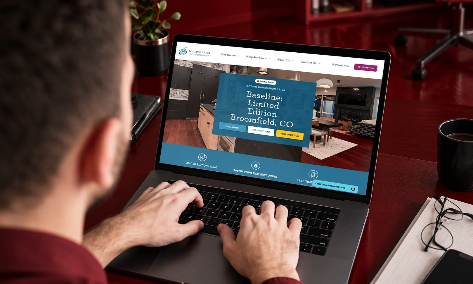
Your CTAs have one job: make it obvious what to do next. No excuses there. Check the wording, where they’re placed, how easy they are to actually notice, and whether they stay consistent across the site. And ask yourself something important does the action you’re pushing actually match where the visitor is in their head right now?
Someone who’s still just browsing and figuring things out is way more likely to click “See How It Works” than “Buy Now.” That second option can scare them off before they’re anywhere near ready.
Also keep an eye out for multiple CTAs competing for attention. When a page throws too many choices at someone, it just feels cluttered, and it waters down the one action you actually care about.
And here’s the thing people get wrong a brighter, bigger button isn’t some magic fix. What surrounds it matters just as much: the offer itself, how much the visitor trusts you at that point, and whether the timing’s even right.
Go Through Your Forms and Checkout
Forms are one of those things that quietly wreck a lot of conversions. Go through each field one by one and ask yourself if it actually needs to be there. The longer a form gets, the more friction it creates especially for someone who isn’t fully sold on you yet.
Look out for labels that don’t make sense, error messages that leave people more confused than before, fields marked required that really don’t need to be, privacy info that’s thin or missing entirely, and anything that just breaks once you’re on mobile.
Checkout needs the same kind of attention. Go through the whole thing yourself, start to finish from adding something to the cart right through to hitting confirm.
Can someone actually see the shipping cost, their payment options, when the delivery’s expected, the return policy, and the total price before they’re asked to commit? Because hidden costs and unclear details showing up at the last second are exactly what makes people bail right before they buy.
Check How Much Trust the Site Builds
People need a reason to believe your business is real and will actually deliver on what it promises.
Go through your reviews, testimonials, guarantees, return policy, contact details, payment info, case studies, company info anything that signals credibility.
These trust signals need to show up where they’ll actually influence a decision, not buried on some “About Us” page nobody visits.
And don’t fake it no manufactured testimonials, no exaggerated claims. Trust comes from information people can actually verify. This lines up with what Google pushes for too: helpful, genuine content, and a warning against manipulative tactics like keyword stuffing or content churned out mainly to game search rankings.
Don’t Forget Mobile And Watch Your Load Times
Auditing only on desktop is a mistake people make more often than you’d think.
Open up your important pages on a few different screen sizes and actually go through the whole journey again, this time on mobile. Buttons, menus, forms, product photos, pop-ups, nav, checkout all of it, but specifically how it behaves on a phone.
Stuff that’s barely noticeable on desktop can become a genuine problem on a small screen. Something that’s easy enough to click with a mouse pointer might be a nightmare to tap with your thumb.
Speed matters here too, maybe more than people give it credit for. A page that loads slowly loses people before they’ve even seen what’s on it.
So don’t treat performance like it’s just an SEO thing you check off separately it’s part of the actual experience someone has using your site.
Figure Out Why People Are Actually Doing What They’re Doing
Your analytics will tell you what happened. It won’t tell you why it happened that part you have to dig for. Depending what tools you’ve got access to, look at heatmaps, watch a few session recordings, send out a survey, read through customer feedback, check support tickets, or run a quick usability test with real people.
Then just look for repeating patterns. Is anyone clicking something that isn’t even a link? Does everyone seem to stop scrolling right before the CTA shows up? Is there some random section where people are lingering way longer than makes sense? Are support tickets full of questions the page should’ve already answered?
Little things like this are what take a vague “something feels off” and turn it into something you can actually go test.
Now Build an Actual Testing Plan
Once you’ve got your findings together, don’t try to fix everything in one go that’s usually where things fall apart. Take your strongest observations and turn each one into something testable.
For example:
“If we show delivery costs earlier in the checkout flow, more people will finish their purchase, because we’ve removed the price uncertainty that was making them hesitate.”
From there you need to nail down what’s actually changing, who sees the change, what number tells you it worked, and how you’ll judge the outcome once it’s in.
Run it the right way proper testing, keep monitoring it, have a real baseline to compare against, and be honest with yourself about the results. And if a test doesn’t come out with a clear winner? That’s fine, that’s not wasted time. It still teaches you something you can use for whatever you try next.
Sort Problems by What Actually Matters
Not everything you find deserves attention right away.
Build a simple priority list using three factors:
Impact + Evidence + Effort
A serious issue on a high-traffic checkout page, backed by solid data, should jump ahead of some small design quirk on a page barely anyone visits.
Roughly, you can bucket things as:
- High priority — serious friction hitting an important conversion point
- Medium priority — a noticeable problem with decent upside if fixed
- Low priority — minor usability or design tweaks
This keeps the whole process focused, instead of a team burning weeks on changes that barely move the needle.
Put It All in a Report
Whatever you hand back to the team needs to be something they can actually act on, not just a pile of observations.
For each major finding, cover:
- Problem — what seems to be going wrong
- Evidence — what data or behavior backs that up
- Recommendation — what should change
- Expected impact — which conversion goal this affects
- Priority — how urgent it is
Laying it out this way turns the audit into a real action plan instead of just a list of opinions.
One Last Thing on Doing This Right
A solid CRO audit should reflect real experience and genuine expertise not just a checklist run through mechanically.
That means backing recommendations with actual evidence, not generic best-practice talk. Be clear about what you actually reviewed, separate what you observed from what you’re assuming, and never promise guaranteed results nobody can honestly promise that.
If you’re putting CRO advice out publicly, be upfront about your methodology and lean on credible sources for anything technical or research-based. Wherever you can, back up what you’re recommending with real analytics, real user feedback, real test results, or documented examples.
At the end of the day, the goal is simple: people should walk away understanding not just what you’re recommending, but why.
FAQs
So how often should you actually do one of these audits?
There’s no magic number here, no “every 6 months” rule that works for everyone. Realistically, you run a full audit when something’s clearly off conversions are dropping, you just pushed a big site redesign, you added a new funnel, or people are suddenly behaving differently than they used to. Outside of those moments, smaller spot-checks here and there are usually enough to keep an eye on things.
What’s actually supposed to be in one?
A proper audit covers a lot of ground your tracking setup, the path users take through the site, landing pages, whether your value prop actually lands, your CTAs, forms, checkout flow, trust signals, mobile experience, load times, real user behavior, and where there’s room to test something new. Not every audit needs to hit all of these equally hard, but they should at least be on the radar.
Which part matters most?
Depends entirely on the site, honestly there’s no universal answer here. What you’re really hunting for is whatever’s causing the biggest drop-off, and the evidence tells you that, not a checklist. Maybe it’s a broken checkout for one business. For another it might just be that nobody understands what they’re selling within the first five seconds.
Does doing this fix conversions right away?
Sometimes, sometimes not. An audit shows you where the problems are it’s not a magic switch. A few fixes might move the needle almost instantly, but plenty of others need real testing and time before you know if they’re actually working or if it was just noise.
Is this just fancy talk for redesigning the website?
No, and that’s actually a pretty common misunderstanding. Design’s one piece of the puzzle, sure, but CRO is way more than that it’s messaging, how people actually make decisions, the analytics behind it, usability, trust, your offers, forms, site speed, all of it working together.
Okay, audit’s done now what?
Don’t try to fix everything at once. Take whatever came out as highest priority, turn it into something you can actually test, make the change in a controlled way, watch the numbers that matter, and use whatever you learn to decide what’s next. Basically, this shouldn’t be a one-and-done thing it works best as a loop you keep coming back to.

Sam Sami
Sam loves discovering how things work and sharing ideas through writing. His goal is simple: create content that is interesting, useful, and helps readers learn something valuable every day.
@SamSami | sam@brandclickx.com | Instagram