


Key Takeaways
The most important User Experience basics are easier to understand when you stop thinking of UX as simply “making a website look good.”
Good UX starts with people.
Understand what they are trying to accomplish. Organize information around their needs. Make interactions predictable. Write clear content. Consider accessibility from the beginning. Plan for mistakes as well as successful journeys.
Then test the experience with real evidence and improve what is not working.
Performance matters too, but it is only one part of the picture. Likewise, visual design matters, but a beautiful interface cannot compensate for a confusing process.
For Brandclickx and other digital teams, the strongest approach is to treat UX as an ongoing part of product development rather than a final design step.
What Is User Experience?
User experience describes the overall experience a person has when interacting with a product or service.
Think about a simple online purchase. A customer may discover a website through search, explore its categories, compare products, read descriptions, add an item to a cart, enter payment details, and later check an order.
UX exists throughout that entire journey.
The experience can be influenced by the website’s navigation, content, interface, accessibility, performance, functionality, interaction patterns, and the user’s expectations and environment.
That is why UX is much broader than making a website visually attractive.
A beautiful website can still provide poor UX if visitors cannot accomplish basic tasks without confusion.
Why User Experience Matters
People normally visit a digital product with a purpose.
They may want to purchase something, find an answer, make an appointment, compare services, contact a company, manage an account, or complete another task.
They do not usually want to spend their time learning how the website works.
Good UX reduces the unnecessary effort between the user and the goal.
This is closely connected with human-centred design. ISO 9241-210 provides guidance for designing interactive systems around people, their needs, requirements, and the context in which they use a system.
That approach changes the starting point.
Instead of asking only what the business wants to build, a UX team can first ask what users are trying to accomplish and where they are currently experiencing difficulty.
UX vs UI: What’s the Difference?
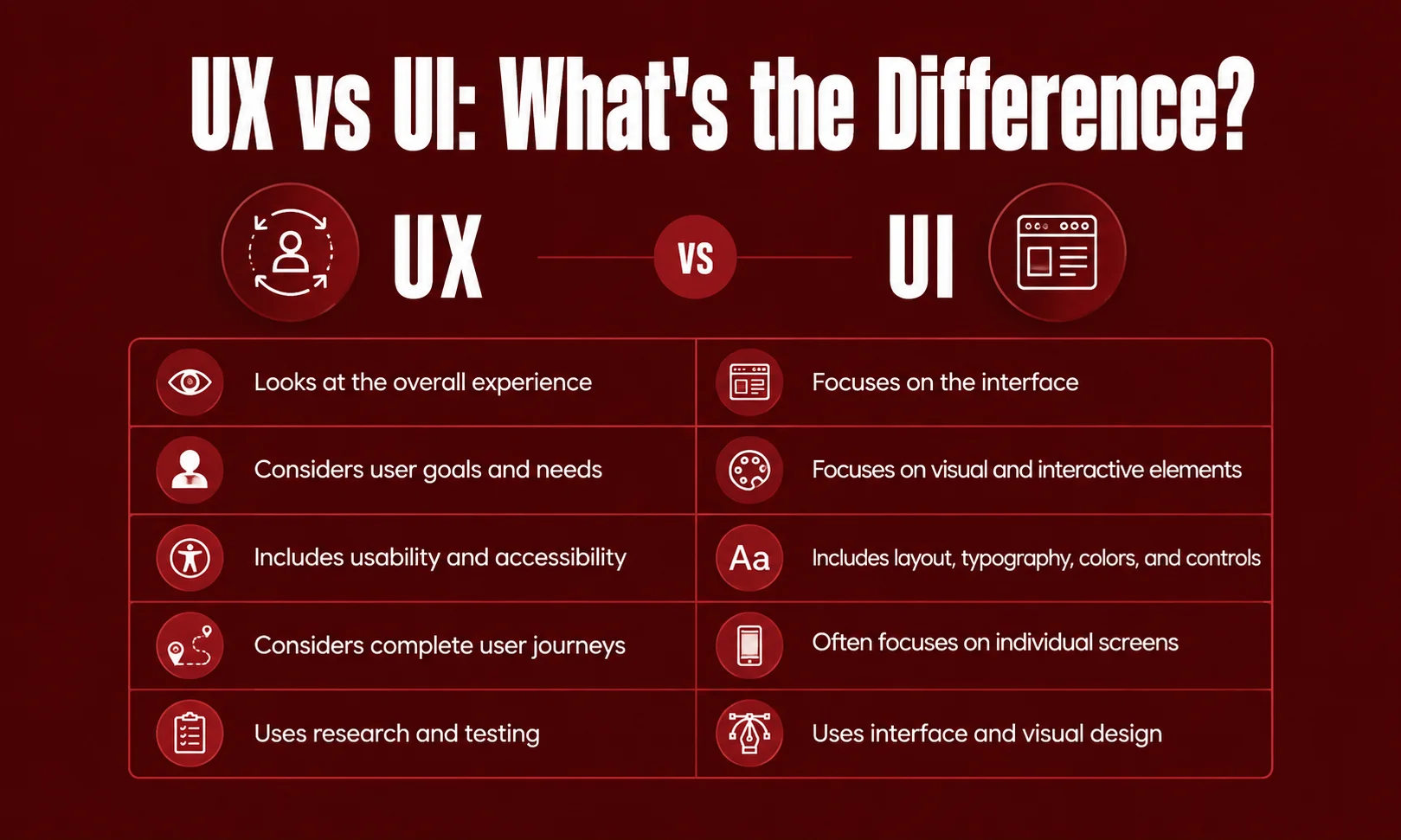
UX and UI are closely related, but they describe different areas.
UI, or user interface, focuses primarily on the interface people see and interact with. UX considers the wider experience surrounding those interactions.
| UX | UI |
|---|---|
| Looks at the overall experience | Focuses on the interface |
| Considers user goals and needs | Focuses on visual and interactive elements |
| Includes usability and accessibility | Includes layout, typography, colors, and controls |
| Considers complete user journeys | Often focuses on individual screens |
| Uses research and testing | Uses interface and visual design |
Imagine a banking application.
The buttons, colors, icons, menus, and typography are part of the UI. Whether customers can easily transfer money, understand their balance, recover from an unsuccessful transaction, and find support is part of the wider UX.
So, UI contributes to UX, but UX is not limited to UI.
The Core User Experience Basics
Several areas come together to create a useful digital experience.
Understanding User Needs
The first step is knowing what people actually want to accomplish.
A customer might want to compare two products. A visitor may only need a phone number. Someone using an application might want to complete a task as quickly as possible.
If the main goal is unclear, the interface can easily become crowded with information that does not help the person in front of the screen.
Good UX starts by understanding the user’s situation rather than assuming everyone will use the product in the same way.
Usability
Usability is one of the most important User Experience basics.
ISO describes usability around whether specified users can achieve specified goals with effectiveness, efficiency, and satisfaction within a particular context of use.
In everyday language, a usable product allows people to get things done without unnecessary struggle.
For example, a checkout process should make it clear what information is required, what the customer is purchasing, how much it costs, and what happens after payment.
Information Architecture
Information architecture is about organizing information and functionality so people can find and understand it.
A website might contain hundreds or thousands of pages. Without a logical structure, visitors can get lost even if every individual page looks good.
Clear categories, descriptive labels, sensible menus, search, breadcrumbs, and meaningful page relationships can make complex websites easier to explore.
The structure should make sense from the visitor’s point of view.
Interaction Design
Interaction design focuses on how people and digital systems respond to each other.
When someone clicks a button, submits a form, opens a menu, uploads a file, or changes a setting, the system should provide understandable feedback.
A useful interaction should make it reasonably clear:
- What can I do?
- What just happened?
- What can I do next?
When users do not have to guess the answer to these questions, the product feels much easier to use.
Visual Design
Visual design plays an important role in comprehension.
Typography, spacing, contrast, alignment, imagery, and visual hierarchy can show users what matters and how different pieces of information relate to one another.
For example, headings can separate topics, spacing can group related content, and visual emphasis can draw attention to important actions.
The goal is not decoration for its own sake.
The interface should look good while helping people understand and use the product.
Content and Microcopy
Words are part of the user interface.
A button labelled Submit gives less information than Create Account when the action is actually creating an account.
Similarly, an error saying Something went wrong gives little direction. A message explaining what failed and what the user can try next is much more useful.
Good UX writing is usually clear, direct, and appropriate for the situation.
Accessibility Is Part of Good UX
Accessibility is not something that should be added after the design is finished.
People use digital products in different ways. Some use keyboards instead of a mouse. Others use screen readers, magnification, voice input, or other assistive technologies.
WCAG 2.2 is the current W3C Recommendation for web accessibility, providing testable guidance for making web content more accessible.
Practical accessibility considerations include:
- Keyboard operation
- Visible focus
- Text alternatives for meaningful images
- Clear headings
- Readable text
- Sufficient contrast
- Accessible forms
- Helpful error messages
- Appropriate labels
- Support for assistive technologies
Accessibility can also improve everyday usability.
A clear label helps someone using a screen reader, but it can also help someone using a phone in a hurry.
The Human-Centred UX Process
UX is not a single design task.
A strong process usually involves understanding people, identifying problems, exploring solutions, testing those solutions, and improving them.
Research
Research helps teams learn what users actually need.
Depending on the project, researchers may use interviews, observation, surveys, usability studies, analytics, customer feedback, support conversations, or other suitable methods.
Each method answers different questions.
For example, analytics may show that visitors frequently leave a checkout page. Testing with users may reveal that they are confused by a particular step.
Define the Problem
After research, the team can identify the problems worth solving.
This might involve user journeys, task flows, personas, requirements, or problem statements.
The objective is not to create paperwork.
It is to develop a shared understanding of what is going wrong and why it matters.
Design
Once the problem is understood, designers can explore possible solutions.
Wireframes are useful at this stage because they allow teams to work on structure before spending significant time on visual details.
More detailed designs can follow once the basic direction is understood.
Prototype
A prototype gives the team something that behaves more like the eventual product.
It can demonstrate navigation, interactions, forms, transitions, and complete user journeys.
This makes it possible to identify problems before the final product is fully developed.
Test
Usability testing allows teams to observe people attempting realistic tasks.
Instead of asking only whether someone likes a design, researchers can look at where participants hesitate, make mistakes, misunderstand instructions, or become stuck.
The purpose is to learn where the product needs improvement.
Improve
UX does not end when the product launches.
Real users continue to reveal problems through feedback, analytics, support requests, accessibility evaluations, and usability testing.
Good UX therefore becomes an ongoing cycle of learning and improvement.
Important UX Principles
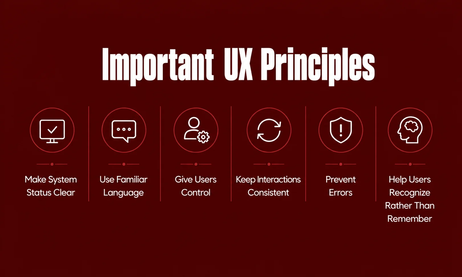
Some UX principles remain useful across websites, applications, and digital services.
Make System Status Clear
People should know what is happening.
If an upload is in progress, show meaningful progress or status information. If a form has been submitted successfully, provide confirmation.
Silence can make users wonder whether they should click again.
Use Familiar Language
Users should not need to understand internal company terminology.
Use words that make sense to the people using the product.
For example, a customer may understand Order History more easily than an internal term such as Transaction Archive.
Give Users Control
People make mistakes.
They may open something accidentally, select the wrong option, or decide they no longer want to continue.
Where appropriate, provide ways to cancel, go back, undo, or recover.
Keep Interactions Consistent
Consistency reduces the amount people need to learn.
If the same type of button behaves differently across different parts of a product, users may become uncertain about what will happen.
Consistent terminology, navigation, and interaction patterns can make the experience easier to understand.
Prevent Errors
It is better to prevent a mistake when possible than to explain it afterward.
For example, a form can show acceptable input formats before submission instead of waiting until the user finishes the entire form.
Help Users Recognize Rather Than Remember
People should not have to remember information unnecessarily.
Visible choices, clear labels, useful instructions, and familiar patterns reduce mental effort.
Good UX Also Plans for Things Going Wrong
Designers often focus on the ideal journey.
The user opens the website, finds the right page, enters correct information, and completes the task.
Real life is different.
A person may search for something that does not exist. A payment may fail. A session may expire. A connection may disappear. A form may contain an error.
These situations are part of the experience too.
A useful error message should explain the problem in understandable language and, when possible, help the person recover.
The same applies to empty states.
Instead of showing a blank page, an empty search result can explain what happened and suggest another action.
Good UX is therefore not only about making success easy. It is also about making recovery understandable.
Mobile and Multi-Device UX
People use digital products across different devices and environments.
Someone may first discover a service on a phone, research it later on a laptop, and return through another device.
A good responsive experience does not necessarily make every screen identical.
Instead, it keeps the important information, actions, and patterns understandable across different contexts.
Mobile UX should consider:
- Readable content
- Touch-friendly controls
- Responsive layouts
- Clear navigation
- Appropriate content priority
- Accessible interactions
- Performance on different connections
The objective is simple: the product should remain useful when the context changes.
Website Performance and UX
Performance is another important part of the overall experience.
A website that responds slowly can interrupt a user’s task, particularly when someone is trying to complete an important action.
Google’s current Core Web Vitals cover three areas:
| Metric | What it measures | Good threshold |
|---|---|---|
| LCP | Loading performance | 2.5 seconds or less |
| INP | Responsiveness | 200 ms or less |
| CLS | Visual stability | 0.1 or less |
Google currently identifies LCP, INP, and CLS as Core Web Vitals, with INP having replaced FID.
However, performance should not be treated as the entire UX strategy.
A website can have strong technical performance and still be difficult to navigate, confusing to read, or inaccessible.
Google’s current documentation also makes clear that page experience involves more than Core Web Vitals alone.
UX and SEO Should Work Together

SEO and UX do not need to compete.
A page can be optimized for search while still being designed around the person reading it.
Google’s current guidance emphasizes helpful, reliable, people-first content rather than content created mainly to manipulate search rankings. Its newer guidance for AI search also encourages unique, useful content instead of simply reworking information that already exists everywhere.
That means a strong page should:
- Answer the visitor’s question clearly
- Use meaningful headings
- Organize information logically
- Avoid unnecessary repetition
- Provide useful original value
- Work well across devices
- Support accessibility
- Maintain good performance
- Make important information easy to find
The best SEO strategy is not to make a page look optimized.
It is to make the page genuinely useful.
UX for AI-Powered Products
AI is changing the way people interact with software.
Instead of navigating through several menus, users can increasingly describe what they want in natural language.
That creates new UX questions.
Users need to understand what an AI system can do, what it understood, what it produced, and what happened after an action.
Transparency becomes particularly important when AI is involved in recommendations, automation, generated information, or actions that affect user data.
The interface should make important actions understandable and give users appropriate control.
The technology may be new, but the underlying UX principle is familiar: people should understand the interaction.
Common UX Mistakes to Avoid
Designing for Yourself
A team knows its own product extremely well.
New users do not.
Something that seems obvious to the designer may not be obvious to someone seeing the product for the first time.
Adding Too Many Features
More features do not automatically create a better experience.
Every additional feature can introduce another decision, control, setting, or learning requirement.
The better question is whether the feature genuinely helps users accomplish something important.
Making Navigation Too Clever
Creative navigation can look interesting but become frustrating in practice.
People should not have to figure out a puzzle just to find a basic page.
Ignoring Accessibility
Accessibility problems are easier to address when considered early rather than discovered after development.
WCAG provides a structured basis for evaluating accessibility rather than relying on assumptions.
Testing Only the Perfect Scenario
Do not test only when everything works.
Also test failed searches, incorrect inputs, empty states, interrupted sessions, slow connections, and other realistic situations.
Confusing Visual Beauty With Good UX
A polished interface is not automatically a usable one.
Visual design should support the user’s goals rather than distract from them.
A Practical UX Checklist
Before launching a website or digital product, ask:
- Is the main user goal clear?
- Can visitors find important information?
- Are navigation labels understandable?
- Are important actions easy to identify?
- Do controls behave as expected?
- Does the system provide useful feedback?
- Are errors explained clearly?
- Are empty states useful?
- Can important tasks be completed with a keyboard?
- Are accessibility needs considered?
- Does the experience work well on mobile?
- Is the content easy to understand?
- Is the website responsive enough for its intended use?
- Have realistic user tasks been tested?
- Have unsuccessful scenarios been tested?
- Are improvements based on evidence?
If several answers are no, there is probably a UX problem worth investigating.
How to Improve User Experience
Start with the most important user journey.
Do not immediately redesign an entire website because the homepage looks old. First find out where people are actually struggling.
Review customer feedback, analytics, usability testing, accessibility findings, support questions, and performance information.
Then prioritize the problems that create the most meaningful friction.
After making changes, test them again.
A simple process looks like this:
Understand → Identify → Design → Test → Improve
That cycle keeps UX grounded in evidence rather than personal preference.
Conclusion
The best digital experiences often feel simple because someone has already done the difficult work behind the scenes.
When navigation makes sense, content answers the right question, buttons behave predictably, errors are understandable, and important tasks do not feel unnecessarily complicated, users may not even notice the UX decisions that made the experience better.
That is the real value of User Experience basics.
UX is not about following one design trend or copying what another website is doing. It is about understanding people, designing around their goals, testing assumptions, and improving the experience over time.
As websites, mobile applications, and AI-powered products continue to evolve, those principles remain useful.
Good UX does not make people work harder to understand the product. It makes the product easier for people to understand.
Frequently Asked Questions
What are User Experience basics?
User Experience basics are the fundamental principles involved in creating products and services that people can understand, use, navigate, and access effectively. They include usability, accessibility, information architecture, interaction design, content, visual design, research, testing, and continuous improvement.
What is UX in simple words?
UX is the overall experience a person has while using a product or service. It includes how easy it is to understand, navigate, use, and complete tasks.
Is UX the same as UI?
No. UI focuses mainly on the interface and its visual and interactive elements, while UX covers the broader experience.
Why is usability important?
Usability helps determine whether specified users can achieve specified goals effectively, efficiently, and satisfactorily in a particular context of use.
What is human-centred design?
Human-centred design puts people, their needs, requirements, and context at the center of interactive system design. ISO 9241-210 provides guidance for this approach.
Is accessibility part of UX?
Yes. Accessibility is an important part of creating digital experiences that can be used by people with different abilities, needs, and interaction methods. WCAG 2.2 provides current web accessibility guidance.
What is the current WCAG version?
WCAG 2.2 is the current W3C Recommendation for Web Content Accessibility Guidelines.
What are Core Web Vitals?
Core Web Vitals are Google’s metrics for important aspects of page experience: loading performance, responsiveness, and visual stability. The current metrics are LCP, INP, and CLS.
Does good UX guarantee better Google rankings?
No. There is no single UX score that guarantees higher rankings. Google considers many signals, and its current guidance emphasizes relevance, helpful content, and overall page experience.
Is UX only important for websites?
No. UX applies to websites, mobile apps, software, services, and other interactive systems.