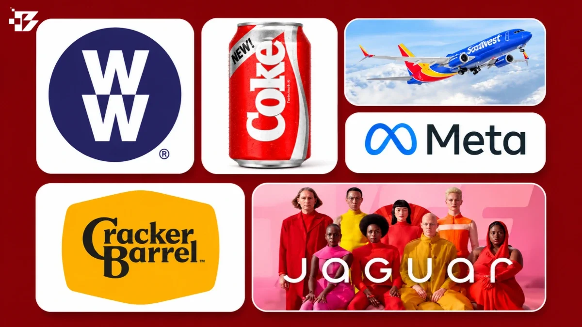
The Rebrand Report: On August 19, 2025, Cracker Barrel removed an old man from its logo. Within hours the internet was in revolt. Within a day the stock had shed nearly $100 million, touching a $200 million intraday loss. Within a week the company had surrendered completely, restoring the man, the barrel, and the words “Old Country Store,” then canceling the restaurant remodels that started the fight. Total elapsed time from launch to full retreat: seven days.
Eight months earlier and an ocean away, Jaguar unveiled a rebrand built on the slogan “Copy Nothing” and a film containing no cars. By April 2025, Jaguar sold 49 vehicles in Europe. Not 49 thousand. Forty nine, down from 1,961 the same month a year earlier, a 97.5 percent collapse. The CEO resigned. The creative agency was dropped. The 102 year old brand became a case study while the case was still happening.
Rebranding is the highest stakes move in marketing, and it is mostly practiced on vibes. Industry estimates suggest roughly 40 percent of rebrands deliver no positive return, while McKinsey found the world’s strongest brands return nearly double what the market does over twenty years. The difference between those outcomes is not creativity. It is a short list of decisions made before the designer opens a laptop.
We reviewed 25 of the most consequential rebrands of the modern era, from billion dollar stock moves to quiet compounding wins, and scored what each one actually did. This is the BrandClickX Rebrand Report.
Methodology. Cases were selected for scale, documentation, and consequence. Each is graded A through F on four factors: strategic necessity (was there a real commercial problem), equity handling (what was kept vs. discarded), execution (rollout discipline), and measured outcome (stock, sales, traffic, or brand value where available). Financial figures come from company filings, exchange data, and cited reporting. Grades are editorial judgment applied to documented facts. Sources at the end.
The Autopsies: Five Expensive Lessons
Cracker Barrel (2025): The Seven Day Surrender. Grade: F
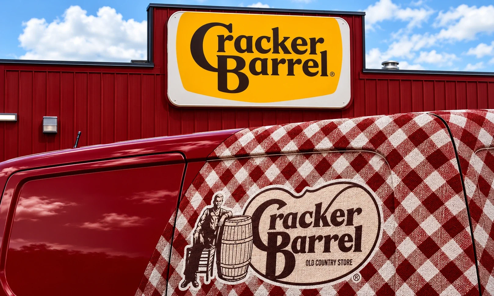
The new logo was not ugly. That is the point. By every rule in a branding brief it was cleaner, more legible, and more modern. What it was not anymore was theirs. The old man leaning on the barrel was a container for fifty five years of road trip breakfasts, and removing him asked customers whether the thing he represented was leaving too.
Traffic fell 8 percent, the stock dropped as much as 25 percent across the saga, and the company reversed the logo in a week and the remodels within a month. Lesson one of this entire report: a logo is not a graphic. It is a receipt for every experience a customer ever had with you.
Jaguar (2024): The Controlled Demolition Question. Grade: D
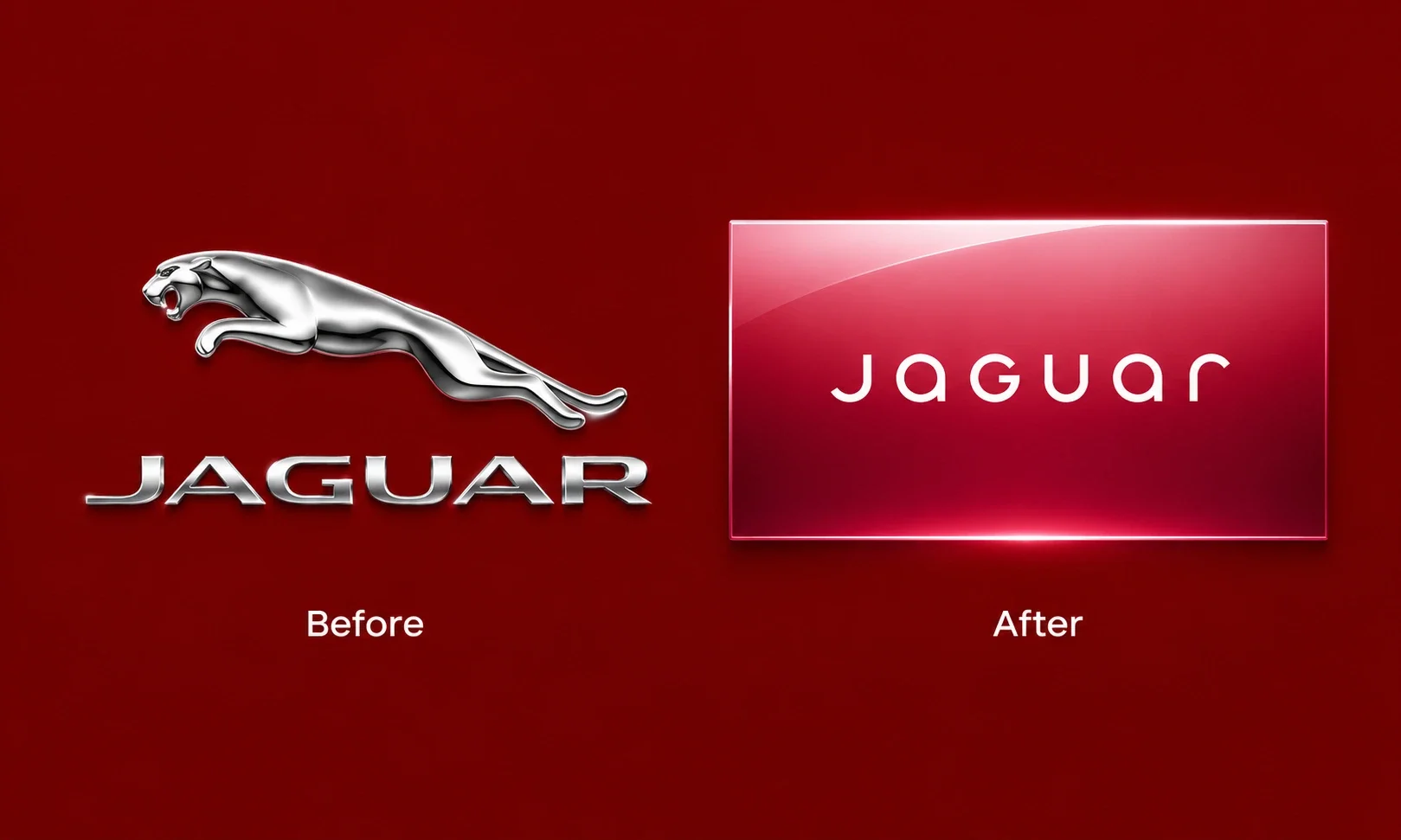
The honest version of the Jaguar story is more complicated than the headlines. The company was winding down its entire legacy lineup to leap into ultra luxury EVs at $125,000 and up, so some sales collapse was scheduled. But the rebrand’s job was to carry the brand across that gap, and it did the opposite: slogans without meaning, a video without cars or aspiration, and an internal design team that reportedly warned against it.
The counterexample from the same era is Apple’s “Think Different,” which also showed no products but made viewers feel like rebels. Emotion without product can work. Emptiness without either cannot. Global sales fell from 180,833 in 2018 to 26,862.
Twitter to X (2023): The $4 Billion Word Thrown Away. Grade: F
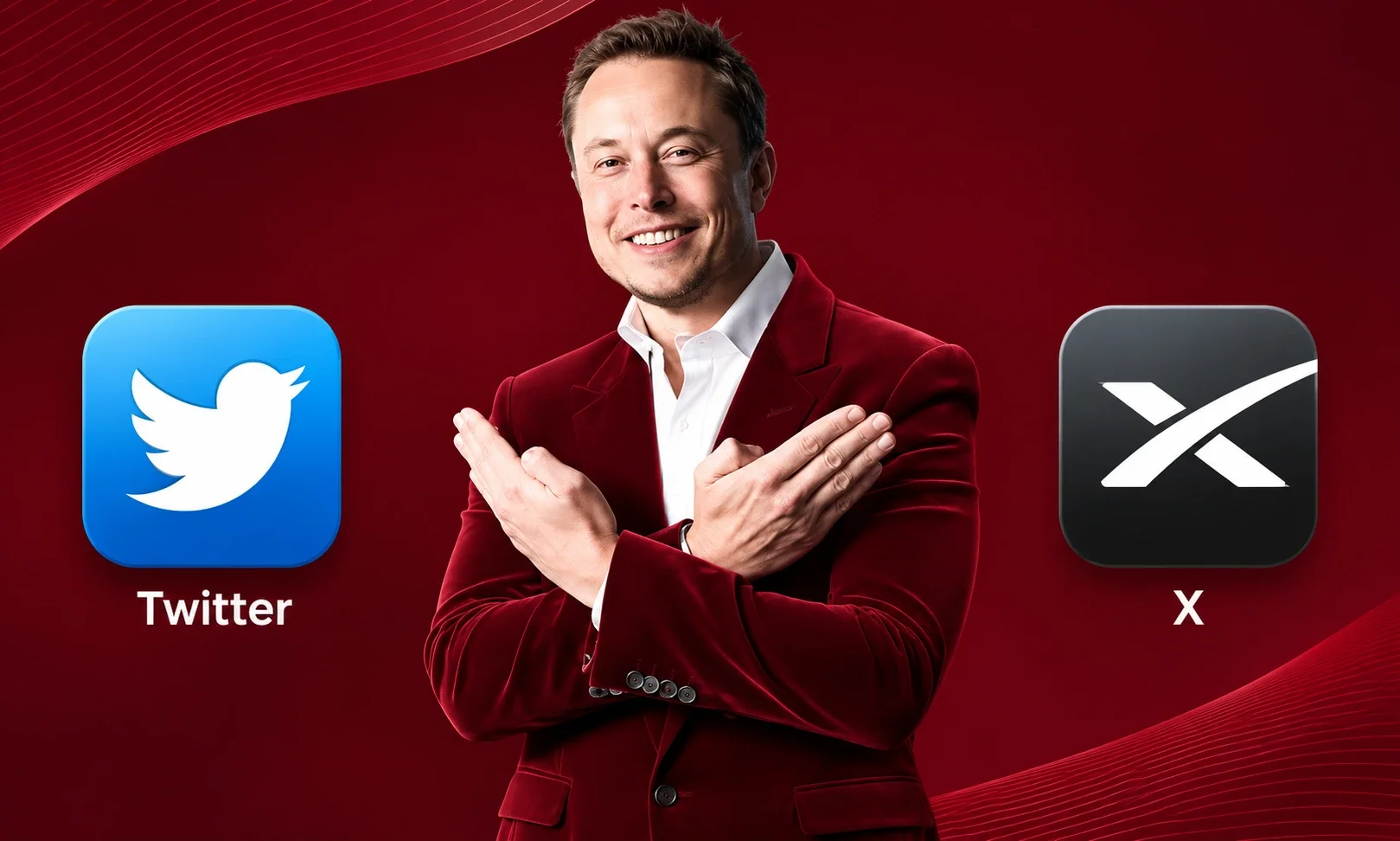
“Tweeting” was a verb in every major language. The bird was one of the most recognized marks on Earth. Both were discarded in a weekend for a letter the company did not culturally own, and brand valuation firms subsequently estimated billions in brand value destruction.
The lesson is about velocity: rebrands fail fastest when they are executed at the speed of one person’s impatience rather than the speed of an organization’s ability to bring customers along.
Tropicana (2009): The $30 Million Carton. Grade: F (with an A for the recovery)
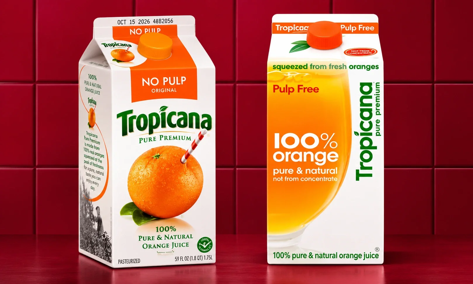
PepsiCo replaced the orange with a straw in it, an image customers used to find the product on a shelf in half a second, with a tasteful glass of juice. Sales fell 20 percent in two months, an estimated $30 million loss, before the company reverted. The detail that matters: customers did not hate the new design in focus groups.
They simply could not find it in stores. Distinctive assets are navigation, and navigation is revenue. Our breakdown of distinctive brand assets covers the mechanics.
Gap (2010): The Original Six Day Retreat. Grade: F
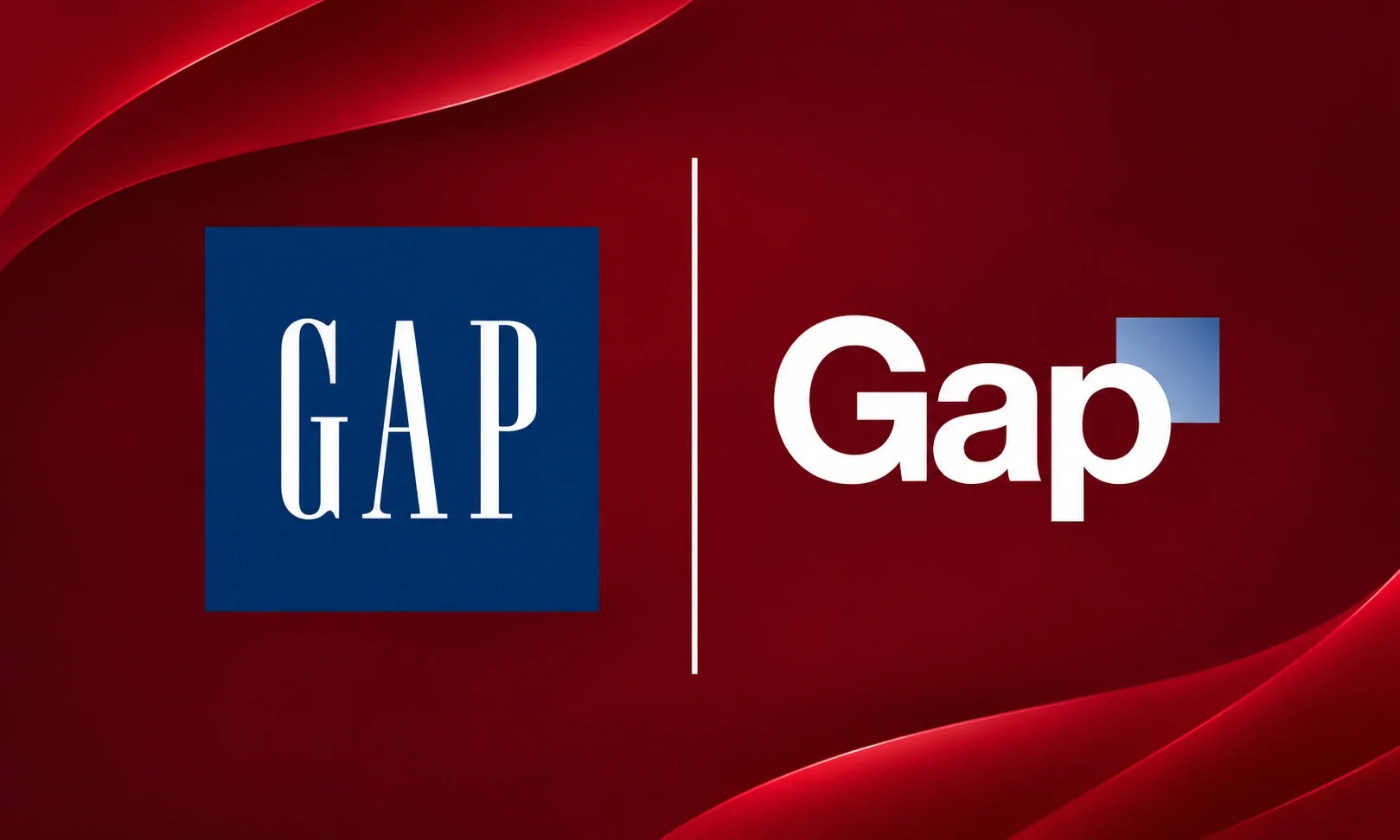
Gap replaced its blue box with a gradient square, the internet erupted, and the company reverted in six days, a record that stood until Cracker Barrel. Fifteen years later the episode reads as innocent: no politics, no identity war, just a design nobody loved. It established the modern playbook fact that the reversal itself, handled quickly, costs far less than stubbornness.
The Wins: Five That Printed Money
Dunkin’ (2019): Subtract to Multiply. Grade: A
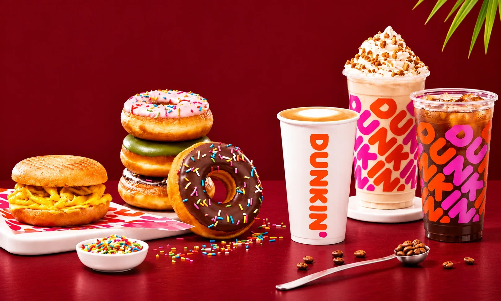
Dropping “Donuts” was a subtraction with a strategy behind it: the company was a beverage business that happened to sell donuts, and the name was capping the menu. The rebrand kept everything customers loved (the colors, the font, the attitude) and cut only the word that limited growth. Revenue and store count both climbed in the years after. The rule it proves: change the smallest possible thing that unlocks the strategy.
Alphabet (2015): The Holding Company Masterclass. Grade: A
Google’s move to Alphabet protected the world’s most valuable brand by not rebranding it. The consumer brand stayed untouched while the corporate structure got a name that could hold everything from search to self driving cars. It remains the template for every conglomerate rebrand since: rename the parent, never the product people love.
Burger King (2021): The Retro Restoration. Grade: A
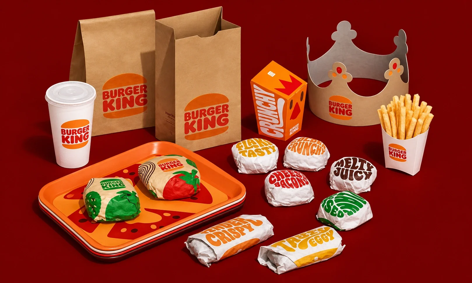
After years of slick minimalism across fast food, Burger King went backwards on purpose, reviving a warmer version of its 1970s look with custom typography named after menu items. The rebrand won design awards, drove double digit lifts in brand perception, and coincided with a genuine sales turnaround. It proved heritage is not an anchor. For the right brand it is fuel.
Pepsi (2023): The First Logo Change in 14 Years Done Right. Grade: B+
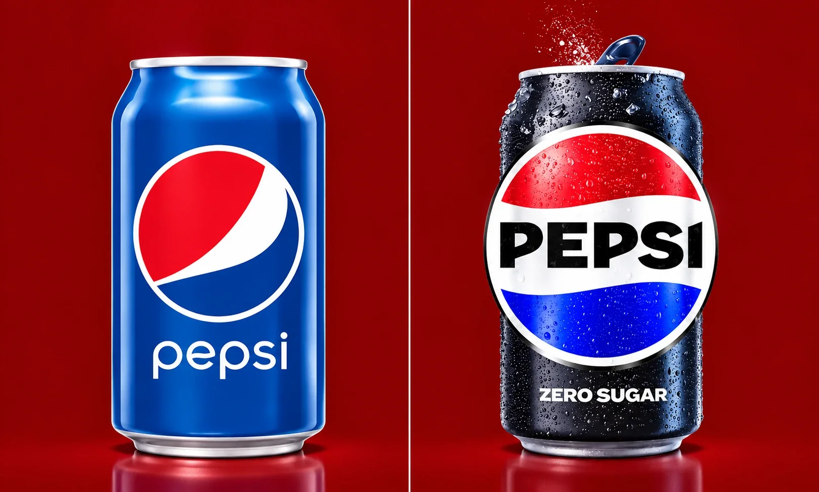
Pepsi’s 2023 globe update worked precisely because it changed almost nothing: the circle, the waves, the red white and blue, rebalanced for screens and given a bolder wordmark. Compare the process with Tropicana’s, executed by the same parent company a decade earlier. Same corporation, opposite outcome. The difference was respect for the equity on the shelf.
HBO Max to Max to HBO Max (2023 to 2025): The Expensive Listening Exercise. Grade: C (the lesson earns an A)
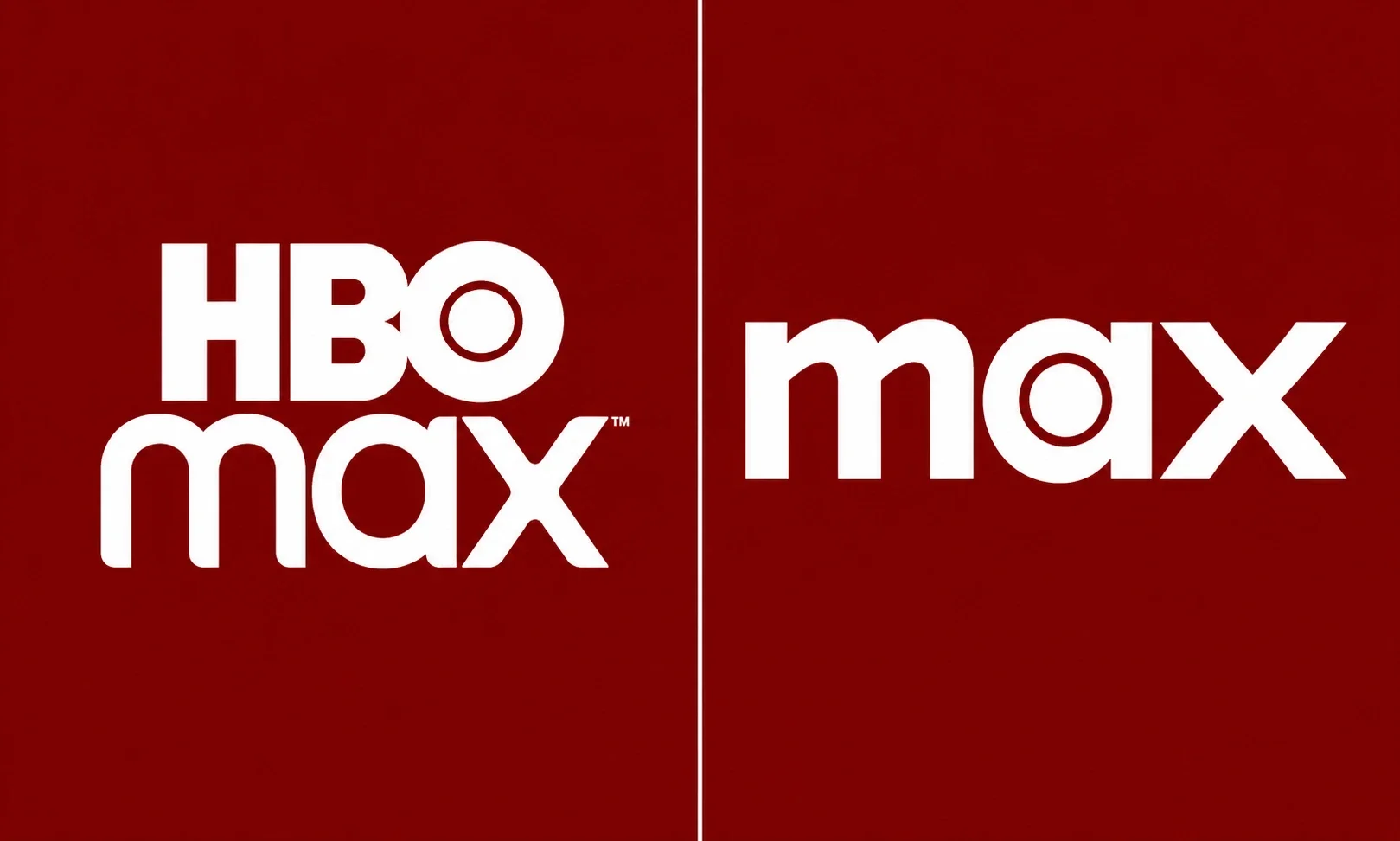
Warner Bros. Discovery stripped “HBO,” the most prestigious three letters in television, from its flagship service, then restored them two years later after the data made the mistake undeniable. The reversal was the smart part. The lesson costs nine figures to learn and you can have it free: when your brand contains the strongest asset in its category, your rebrand’s job is to amplify it, not amputate it.
The Scorecard: 15 More, Graded
| Rebrand | Year | Grade | One Line Verdict |
| Facebook to Meta | 2021 | B | Corporate rename insulated apps; metaverse bet is separate question |
| Mailchimp | 2021 | A | Weird stayed weird, just organized; equity fully preserved |
| Weight Watchers to WW | 2018 | D | Initial confusion and subscriber losses; partial recovery later |
| Airbnb | 2014 | B+ | Mocked for a month, then became one of tech’s most copied identities |
| Uber | 2018 | A | From cold “bit” to warm accessible system; rider trust metrics rose |
| Mastercard dropping its name | 2019 | A | The circles were strong enough to stand alone; flawless equity read |
| 2016 | B+ | Polarizing gradient, now invisible how much it is loved | |
| Walmart refresh | 2025 | B+ | Cracker Barrel’s nightmare handled as a gentle evolution, no revolt |
| Slack | 2019 | C+ | Fine design, loud backlash, survived on product strength |
| Nokia | 2023 | C | Changed the logo, forgot to change the story |
| Johnson & Johnson | 2023 | B+ | Script to sans serif, handled as modernization not identity surgery |
| 2023 | A | Snoo got friendlier, community stayed intact, IPO followed | |
| Kia | 2021 | C+ | Millions still search “KN car” yearly; legibility is not a detail |
| Zillow | 2019 | B | Quiet, confident, business aligned; nobody noticed, which was the point |
| Paramount rebrand of CBS All Access | 2021 | B+ | Plus signs everywhere, but the mountain still means movies |
The Five Laws (What the Data Actually Separates)
Law 1: Winners subtract limits, losers subtract meaning. Dunkin’ cut a word that capped growth. Cracker Barrel cut a symbol that carried memory. Same move, opposite physics. Before changing anything, list every asset customers use to find and feel you. The rebrand may touch the strategy. It may not touch the list.
Law 2: Speed kills, both ways. X and Gap show what happens when rebrands move at executive speed. But Cracker Barrel and Tropicana show the reversal must move just as fast. Every day of defense deepens the loss. Pre decide your retreat triggers before launch.
Law 3: Heritage is fuel for some brands and a ceiling for others. Burger King won by going backwards. Jaguar lost by abandoning forwards and backwards at once. The variable is whether your heritage still has buying energy in it. Measure that before you touch it.
Law 4: The shelf test beats the focus group. Tropicana’s design tested fine and failed in stores. Always test for findability and recognition in context, not preference in isolation.
Law 5: Rename the parent, protect the child. Alphabet, Meta, and every successful conglomerate rebrand follows the same rule: corporate umbrellas can be renamed freely, consumer brands almost never. We track which current giants hold the most equity to protect in our most valuable brands ranking.
For the tactical playbook, our library covers both sides of this coin: successful rebrand examples, failed rebrand examples, and the complete rebranding guide for teams mid decision.
Frequently Asked Questions
What percentage of rebrands fail?
Industry estimates suggest roughly 40 percent of rebrands deliver no positive return on investment, most often citing weak research, missing strategy, and poor rollout. Treat the exact figure as an estimate; the directional finding is consistent across sources.
What was the most expensive rebrand failure?
By market reaction, Cracker Barrel lost nearly $100 million in market value in a single day in August 2025. By brand value destruction over time, the Twitter to X transition is widely estimated in the billions. Tropicana’s 2009 packaging failure cost roughly $30 million in two months.
What makes a rebrand successful?
The pattern across our 25 cases: a real commercial problem driving the change, ruthless preservation of distinctive assets customers use to find and feel the brand, disciplined rollout, and pre decided reversal triggers if the market revolts.
How long should a rebrand take?
Benchmarks run seven months to eighteen for full rollout across every touchpoint. The strategic phase, research and equity mapping, should never be the part that gets compressed.