


Modern CSS Architecture Guide: CSS feels manageable when you’ve got a few pages and a small team working on them. Then the product grows, and everything starts creaking. One button somehow ends up with five slightly different versions of itself, a tiny spacing tweak on one page quietly breaks another, and developers start reaching for !important just to get something to actually work. That’s the point where a real CSS architecture stops being optional.
And this isn’t about locking yourself into one strict methodology and following it word for word. It’s really just about building a system where people can tell where a style is supposed to live, how it might ripple out to other parts of the app, and whether tweaking it is going to quietly wreck something three pages over.
For something enterprise-scale, good architecture means CSS stays maintainable, reusable, testable, and able to actually scale as the product keeps growing. This guide from BrandClickx goes through a practical approach, combining modern CSS features with a few architecture ideas that have held up in real projects, not just in theory.
What Is CSS Architecture?

CSS architecture, when you strip it down, is really just how a team keeps everything organized, the styles, the files, the components, naming conventions, design tokens, and how the cascade behaves once real code starts piling on top of it. A small project doesn’t need to think about this much, one stylesheet, done. Enterprise apps are a different story though. You’ve got hundreds of components, several teams working in the same codebase, multiple themes, third-party libraries dropped in, thousands of rules stacked on top of each other. Without something holding that together, CSS gets unpredictable fast, and not in a fun way.
A good architecture answers simple questions:
- Where should a new style go?
- Which styles are global?
- Which styles belong to a component?
- How should developers handle overrides?
- How are colors and spacing shared?
- How can one team change a component without breaking another?
The goal is simple: make the CSS predictable as the application grows.
Why Enterprise Apps Need a CSS Strategy
Large applications usually have more than just more code. They also have more people working on that code. One developer may build the dashboard while another works on the checkout page. A third team may maintain a shared component library. Without shared rules, every team can develop its own way of writing CSS.
This often leads to:
- duplicated styles
- conflicting selectors
- high specificity
- inconsistent spacing
- difficult overrides
- unused CSS
- slow development
- fragile UI changes
A strong architecture reduces these problems by giving the whole team a common structure.
The Core Principles of Modern CSS Architecture
There is no single architecture that works for every company. However, most successful systems share a few important principles.
Keep Global CSS Small
Global styles affect a large part of an application, so they should be used carefully.
Global CSS can define things such as:
- basic typography
- page defaults
- CSS custom properties
- form defaults
- accessibility-related styles
- resets or normalization
Avoid putting component-specific rules into the global layer. A .card-title style should normally belong to the card component rather than being mixed into a huge global stylesheet.
Prefer Low Specificity
Specificity problems are one of the biggest causes of CSS frustration. For example, a selector like this can become difficult to override:
.dashboard .content .card ul li a.primary { color: blue; }A simpler class is easier to manage:
.primary-link { color: blue; }Modern CSS gives developers even better tools for controlling the cascade. Cascade layers can establish clear precedence between groups of styles instead of forcing developers to win specificity battles.
Use Cascade Layers for Large Codebases
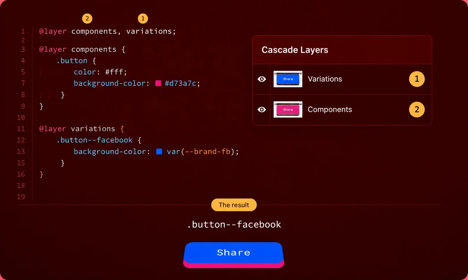
One of the most useful modern CSS features for enterprise projects is @layer. A team can define an architecture such as:
@layer reset, base, components, utilities;Styles can then be placed inside their intended layer:
@layer base { body { margin: 0; font-family: system-ui, sans-serif; } } @layer components { .button { padding: 0.75rem 1rem; } } @layer utilities { .hidden { display: none; } }This gives developers a clear order for the major parts of the stylesheet. It is particularly useful when an application includes styles from multiple teams, component libraries, or third-party packages. MDN notes that cascade layers can help manage situations where many different sources of CSS need to work together.
Organize CSS Around Components
Enterprise applications are usually built from reusable interface pieces.
Think about:
- buttons
- forms
- navigation
- modals
- cards
- tables
- alerts
- dropdowns
- sidebars
Each component should have a clear home for its styles. A practical structure might look like this:
styles/ ├── base/ ├── tokens/ ├── layout/ ├── components/ ├── utilities/ └── vendors/The exact folders are less important than having rules that everyone follows. For a React, Vue, or similar application, component styles can also live close to the component itself when that fits the project’s architecture.
Use Design Tokens Instead of Random Values
A growing application should not contain hundreds of slightly different colors and spacing values. Instead, define reusable design tokens. Modern CSS custom properties make this straightforward:
:root { --color-primary: #2563eb; --color-text: #1f2937; --space-sm: 0.5rem; --space-md: 1rem; --radius-md: 0.5rem; }Then use them throughout the application:
.button { background: var(--color-primary); padding: var(--space-sm) var(--space-md); border-radius: var(--radius-md); }This makes large design changes much easier. If the brand color changes, developers can update the token instead of searching through hundreds of files. Tokens can also support themes such as light mode, dark mode, and product-specific branding.
BEM Still Has a Place
BEM, or Block Element Modifier, remains useful as a naming convention.
For example:
.card {} .card__title {} .card--featured {}The idea is easy to understand. The block represents the component. The element represents a part of it. The modifier represents a variation.
BEM does not need to be used everywhere. A team can combine BEM-style naming with component-based development, CSS Modules, utilities, or cascade layers. The important thing is consistency.
ITCSS Can Help With Large CSS Systems
ITCSS, or Inverted Triangle CSS, organizes styles from broad and generic rules toward more specific component and utility rules.
A traditional structure includes:
- Settings
- Tools
- Generic
- Elements
- Objects
- Components
- Utilities
The benefit is that developers have a predictable place for different types of styles. ITCSS is still useful as a mental model, but modern CSS features mean teams do not need to copy an old setup exactly. Cascade layers can provide a more direct way to express some of the same ordering ideas.
Use Modern CSS Features Where They Solve Real Problems
Modern CSS has reduced the need for some older workarounds.
CSS Nesting
Native CSS nesting can make related rules easier to read:
.card { padding: 1rem; & .title { font-weight: 700; } &:hover { transform: translateY(-2px); } }CSS nesting became Baseline Newly available in 2023, making it a practical option for modern projects with appropriate browser support requirements.
Container Queries
Media queries are useful when the entire viewport controls a layout. Container queries are better when a component needs to respond to the space available around it. For example, a card may appear in a wide grid on desktop but inside a narrow sidebar on another page.
Container queries let the component respond to its container rather than assuming the screen size. This makes reusable components more flexible. Web.dev also identifies container queries as an important part of modern CSS.
Subgrid
CSS Grid and subgrid can reduce the need for extra markup and complicated alignment tricks. They are especially useful when related components need to share column or row alignment. Modern CSS should not mean using every new feature simply because it exists. Use a feature when it makes the code clearer or removes unnecessary complexity.
Keep Utilities Small and Purposeful
Utility classes can be extremely useful in large applications.
Examples include:
.hidden {} .text-center {} .flex {} .items-center {} .mt-md {}They provide quick, predictable changes without creating another component-specific selector. The problem starts when utilities become random collections of one-off rules. A good utility system has clear naming, consistent tokens, and documented usage.
Avoid !important as a Normal Solution
!important is sometimes necessary, especially when working with external styles or special utility rules. But using it every time a style does not work usually creates a bigger problem.
For example:
.button { color: red !important; }Later, another developer needs a different color and adds another !important. Soon the stylesheet becomes a competition over which rule is stricter. A better approach is to fix the cascade, reduce specificity, or use appropriate cascade layers.
A Practical Enterprise CSS Structure
A modern enterprise application could use a structure such as:
styles/ ├── tokens/ │ ├── colors.css │ ├── spacing.css │ └── typography.css │ ├── base/ │ ├── reset.css │ └── global.css │ ├── layout/ │ ├── container.css │ ├── grid.css │ └── stack.css │ ├── components/ │ ├── button.css │ ├── card.css │ ├── modal.css │ └── navigation.css │ ├── utilities/ │ ├── spacing.css │ ├── display.css │ └── accessibility.css │ └── vendors/ └── third-party.cssYou do not have to copy this structure exactly. The best structure is the one your team can understand and maintain.
How to Scale CSS Across Multiple Teams
Enterprise CSS is also a people problem. A technically perfect architecture can fail if developers do not follow the same rules.
Create a short CSS style guide that explains:
- naming conventions
- component ownership
- token usage
- cascade layer order
- when to create a utility
- when to create a component
- acceptable selector specificity
- how third-party CSS is handled
Code reviews should also check architecture, not just whether the page looks correct. This prevents technical debt from building quietly.
Modern CSS Architecture Guide: Test CSS Like Application Code
CSS can break important parts of an application even when the code looks harmless. Large teams should test important UI states and responsive layouts.
Check:
- desktop layouts
- mobile layouts
- keyboard navigation
- focus states
- dark mode
- long text
- localization
- reduced-motion preferences
- different content lengths
Visual regression testing can also help detect unexpected changes in shared components.
Common CSS Architecture Mistakes
One Giant Stylesheet
A massive stylesheet becomes difficult to search and understand.
Too Many Global Selectors
Global selectors make components less independent and increase the chance of side effects.
Excessive Specificity
Deep selectors create unnecessary cascade problems.
Copying Styles Between Components
If five components contain nearly identical CSS, consider whether they should share a component, token, utility, or pattern.
Using a Methodology Without Understanding It
BEM, ITCSS, OOCSS, and other approaches are tools. They are not goals. Choose the parts that solve your actual problems.
What Makes a CSS Guide Trustworthy?
A useful technical article should do more than repeat definitions. For a CSS architecture guide, experience can come from discussing practical problems teams face when maintaining large codebases. Expertise comes from accurately explaining the cascade, specificity, components, design tokens, and modern CSS features.
Authoritativeness comes down to backing things up with solid technical documentation and being upfront about who actually wrote or reviewed the content. Trustworthiness is a bit different; that’s about getting the facts right, being transparent about where information comes from, not overselling claims, and being honest about where the limitations are.
Google’s own guidance basically says the same thing: make it clear who created the content, how it came together when that’s actually relevant, and why it exists in the first place. For Brandclickx, a strong implementation would include an author byline, an author profile where appropriate, a clear last-reviewed date, and links to authoritative CSS documentation.
Final Thoughts
Modern CSS architecture really isn’t about hunting down one perfect methodology. It’s about building something developers can actually wrap their heads around.
For an enterprise app, start small: a handful of strict rules is enough. Keep global styles under control. Use reusable tokens instead of one-off values. Organize things around components. Bring in cascade layers when they genuinely give you more control, not just because they’re new. Same with nesting, container queries, whatever, use them when they solve an actual problem, not because they’re trendy.
The thing to watch out for is letting the architecture get more complicated than the app it’s supposed to support. A good CSS system should make the next feature easier to ship, not turn into another set of rules developers have to fight through just to add a button.
That’s really the whole point of scalable CSS architecture, and it’s the approach BrandClickx recommends for building modern web applications.
FAQs
What is the best CSS architecture for an enterprise application?
There is no single best architecture for every enterprise app. A practical system usually combines component-based styles, design tokens, controlled cascade layers, utilities, and clear naming rules.
Is BEM still useful in modern CSS?
Yes. BEM can still provide clear naming and component boundaries. It can also be combined with CSS Modules, cascade layers, and modern CSS features.
Should enterprise apps still use CSS preprocessors?
Not necessarily. Modern CSS handles a lot of what used to need Sass or something similar, more than most people realize, honestly. So it’s less about whether preprocessors are good or bad, and more about whether one’s actually still useful for how your team works. Keep it if it’s genuinely pulling its weight. Drop the habit of grabbing one by default just because that’s what everyone’s always done.
Are CSS cascade layers worth using?
For large applications, they can be very useful. Layers give teams an explicit way to control groups of styles and reduce dependence on selector specificity.
How do you keep CSS from turning into a mess over time?
Honestly, it comes down to a handful of habits: don’t let global styles sprawl, use design tokens instead of hardcoding values everywhere, keep specificity low so overrides don’t turn into a war, organize components so people can actually find things, write your conventions down somewhere people will read them, and don’t wave CSS through code review just because it’s “only styling.”