Ever visited a website, found something interesting, but didn’t take action? That’s because the CTA wasn’t strong enough. A powerful Call-to-Action (CTA) isn’t just a button – it’s a nudge, a push, and sometimes, the final spark that convinces someone to click.
The right CTA can boost sign-ups, increase sales, and keep visitors engaged. But a weak one? It gets ignored. So, how do you craft compelling calls-to-action that grabs attention and drives action? Let’s dive into the secrets of writing CTAs that convert.
Why CTAs Matter?
CTAs are essential for guiding users. They help businesses get more clicks, sign-ups, and sales. Without them, visitors may leave without taking action.
1. Increase Conversion Rates and Engagement
A strong CTA turns visitors into customers. It encourages them to take the next step. When users know what to do, they engage more.
CTAs keep people on a website longer. They make interactions smoother. A simple prompt can improve results.
2. Guide Users Toward Desired Actions
People need clear direction. A CTA removes confusion and makes decisions easier. When users see a clear next step, they are more likely to take it.
Without a CTA, they may hesitate. A direct message helps them move forward. The right wording makes a big difference.
3. Create Urgency and Motivation
Urgency pushes people to act fast. When something feels limited, users don’t want to miss out.
Motivation also matters. Strong words make actions feel rewarding. The right CTA turns hesitation into quick decisions.
Also Read: How To Structure Blog Posts For Better Readability
How to Craft Compelling Calls-to-Action (CTAs)
1. Use Action-Oriented Language
The language of CTAs really makes a lot of difference. Strong verbs make CTAs more compelling. Instead of passive phrases, use direct commands like “Download Now,” “Get Started,” or “Try for Free.” This tells users exactly what to do.
Avoid vague words like “Click Here” or “Learn More.” They don’t create urgency or excitement. A better alternative would be “Claim Your Free Guide” or “Shop the Sale Before It Ends.”
Hubspot’s CTA, “Get Free CRM,” is a good example. The word free is enough to entice visitors.

2. Highlight the Benefit
People take action when they see value. A CTA should clearly explain what they gain. Instead of “Sign Up,” say “Sign Up & Get 20% Off Your First Order.” This makes it more enticing.
Use words that emphasize benefits. For example, “Unlock Exclusive Content,” “Boost Your Productivity,” or “Start Your Free Course Today.” The more specific the benefit, the better the response.
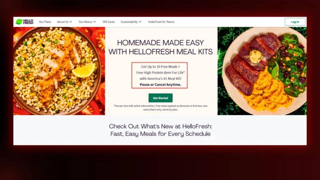
Check out the following CTA by Hellow Fresh. It is a great example of highlighting the benefits to make the offer irresistible.
3. Create Urgency
A sense of urgency makes people act fast. Limited-time offers or exclusive deals work well.
Urgency works because people don’t want to miss out. Even a simple “Join Now Before Prices Go Up” can push hesitant users to decide. Just make sure the urgency is real—fake scarcity can hurt trust.
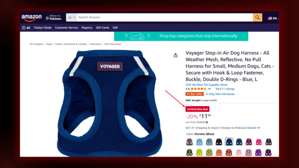
This product on Amazon with the tag Limited Time Deal is enough to give buyers a sense of urgency.
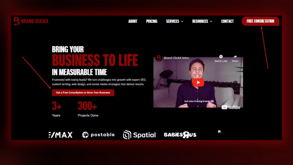
4. Make It Visually Stand Out
A CTA should grab attention instantly. Use contrasting colours to make it pop. A red or orange button on a white background is easier to see than a dull grey one.
The size also matters. A CTA shouldn’t be too small or too big. Place it where users naturally look, like above the fold or at the end of an article. Try to make it more noticeable with contrasting colours.
Check out CTAs on the Brand ClickX Landing Page!
5. Keep It Short & Clear
People scan rather than read. A long or complicated CTA loses effectiveness. Stick to short phrases like “Join for Free,” “Start Your Trial,” or “Claim Your Gift.”
The message should be easy to understand. Avoid jargon or unnecessary words. If a user has to think too much, they might skip it. Keep it simple, direct, and to the point.

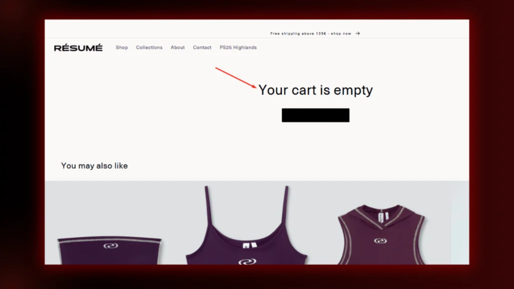
6. Use Personalization
A personalized CTA feels more engaging. Instead of a generic “Sign Up,” try “Sign Up, Sarah, and Get Your First Month Free.” Adding a name makes it feel tailored.
Even without names, CTAs can be personalized based on user behaviour. For example, “Continue Watching Your Course” or “Resume Your Shopping Cart.” This makes the CTA feel more relevant.
7. Reduce Risk
People hesitate when there’s a perceived risk. Address their concerns with reassuring CTAs. For example, “Try for Free – No Credit Card Needed” removes the fear of hidden charges.
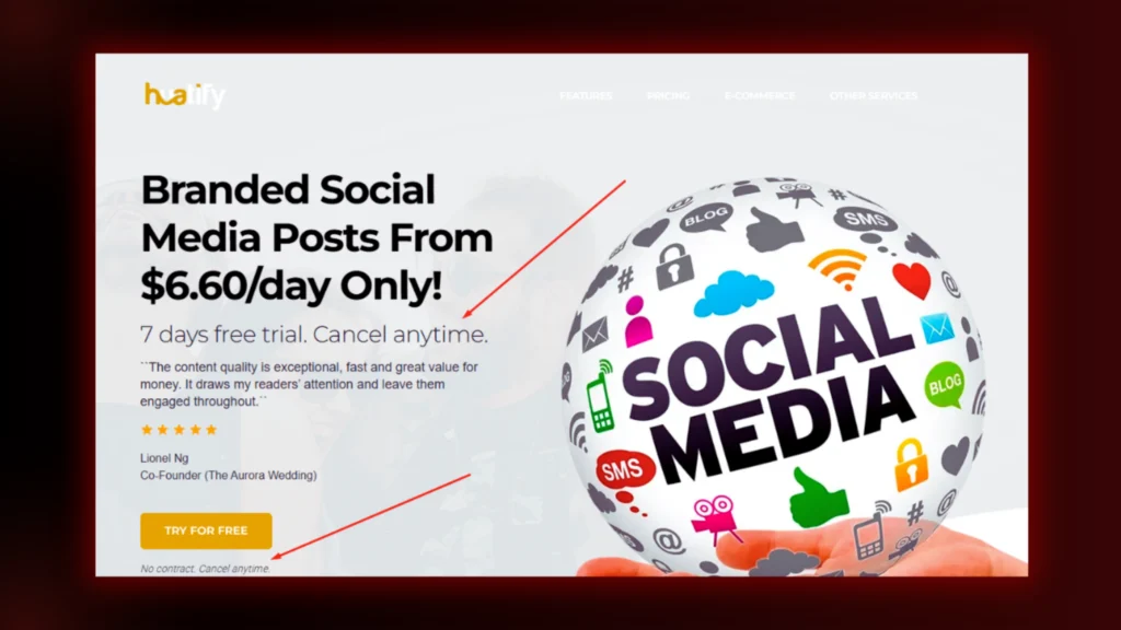
Money-back guarantees or trial periods also help. “Get a Full Refund If You’re Not Satisfied” makes people feel safe about their decision. A low-risk CTA increases trust and conversions.
Also Read: Writing Pillar Content For SEO Success and Rankings in 2025
8. Strategic Placement Matters
CTAs should appear at the right moment. If placed too early, users might ignore them. If it is too late, they may lose interest. A good approach is placing CTAs at the end of a blog post, in pop-ups, or near key content.
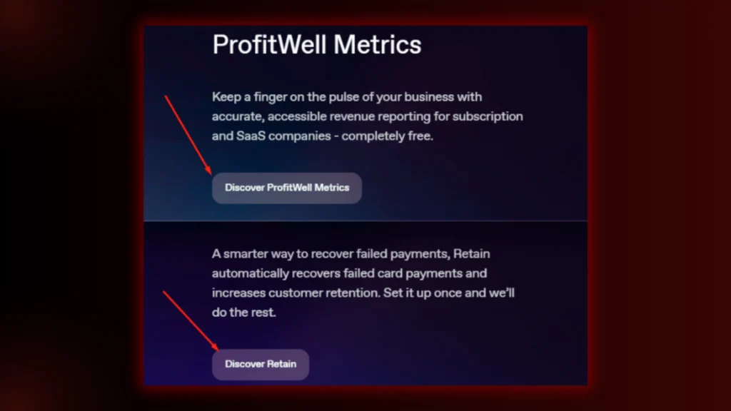
Multiple CTAs work if they don’t feel overwhelming. For example, a primary CTA (“Start Your Free Trial”) can be supported by a secondary one (“Learn More”) for hesitant users. Proper placement increases the chances of action.
Check out how Paddle has placed CTAs for each step, guiding visitors on what to do next and where to find what they need. Each step of the process is clearly directed.
9. Test & Optimize
Not all CTAs work the same. A/B testing helps determine which ones work best. Try different colours, wording or button sizes to see what gets more clicks. Even small changes can make a big difference. For example, changing “Get Started” to “Start My Free Trial” might increase conversions. Regular testing ensures that CTAs stay effective over time.
FAQs
1. How to Write a Compelling Call to Action?
Keep it clear, direct, and action-packed. Use strong verbs like “Get,” “Start,” or “Claim.” Highlight the benefit—tell users what they’ll gain. Add urgency to push quick decisions. Make it easy to spot and hard to ignore.
2. How to Build a Stronger CTA?
Use powerful words that spark action. Keep it short but persuasive. Place it where users naturally look. Test different versions to see what works best. The right colour, wording, and placement make all the difference.
3. What 3 Elements Should Be in a Call to Action?
- Action-oriented language – Tell users exactly what to do.
- A clear benefit – Show what they’ll get in return.
- Urgency or scarcity – Make them act fast.
4. What Is a Good Example of a CTA?
“Start Your Free Trial Today.” It’s clear, action-driven, and offers something valuable. Simple, direct, and effective.
Conclusion
A great CTA makes all the difference. It guides, sparks and pushes. The key is to be clear, engaging and persuasive. Use strong words, highlight the benefits and create urgency.
With the right CTA, you can boost conversions and grow your business. Need help with high-converting CTAs? Brand ClickX can do it for you! Contact us today and take your brand to the next level!

